
Office Design
Posted: July 1, 2016 Filed under: Design Inspiration, My Design | Tags: before and after, design reno, Interior design, office design ideas, office transformation, Subway Tile, wood beams Leave a commentTwo years ago, I was able to design my first office.

If you didn’t see my post on that office, you can see it here.
Well, two years later in the same building, another company hired me to design their office and whew, did I have my work cut out for me.
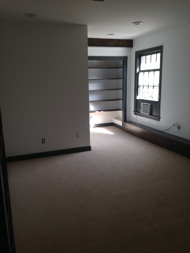
I had the first walkthrough at the beginning of February. Here is what I walked into. Fluorescent lighting, lime green, tan…eek!
They needed individual offices in this big open room so the painters tape on the carpet is where we were planning to build individual offices.

Other side of the room

My first thought was that the space felt stark and uninviting so my goal was to add character and warmth. I pulled inspiration from my other office..high contrast, clean, industrial and wood elements. The tough thing about this space as opposed to the other office was that this office has zero natural light where as the other office had tons of natural light. Trying to make this space feel inviting was quite the task.
First things first, remove carpet.
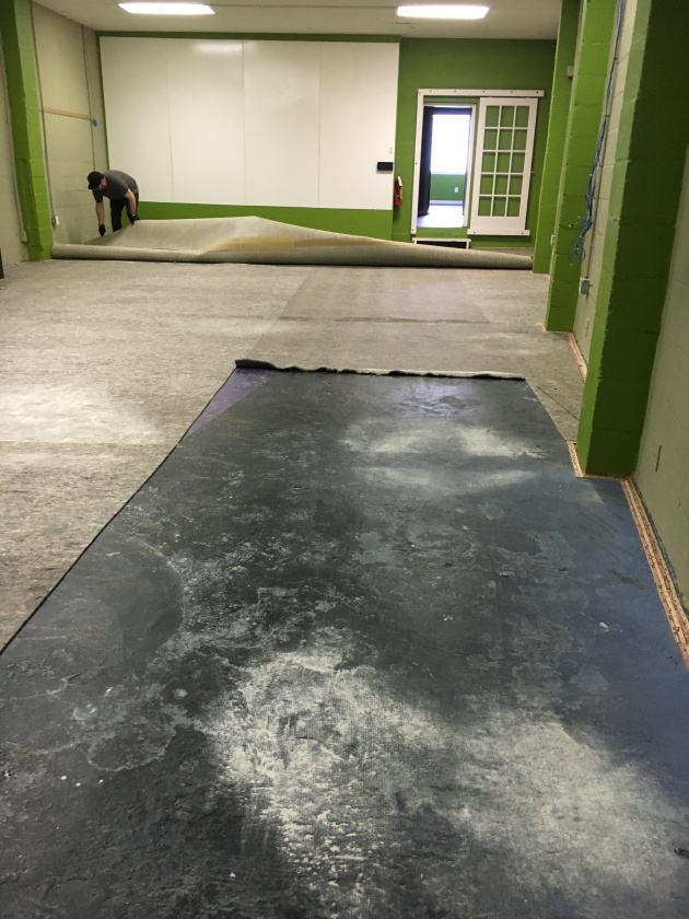
My initial vision was to sand, stain and seal the concrete for a clean, industrial look. Similar to this:
Unfortunately, once the carpet was removed we found that the concrete was not in great condition. Uneven, crumbling in certain places and not able to be sanded down. On top of those issues, the building is old with no elevator so the concrete guys had no way of getting their 1000 pound equipment in the room. Had to change plans so I decided to go with painted concrete.
Moving forward from there was office build out.
Framing.

Sheetrock done.

I decided to add windows on the ends of the build out to make it feel more open for the people working in the offices. If they can’t have natural light they can at least have a window. 🙂

After the office build out, the lime green cinderblock columns got wrapped in wood and stained a rich walnut brown. I knew the first time I saw the space that the columns needed to be wrapped in wood to add character.
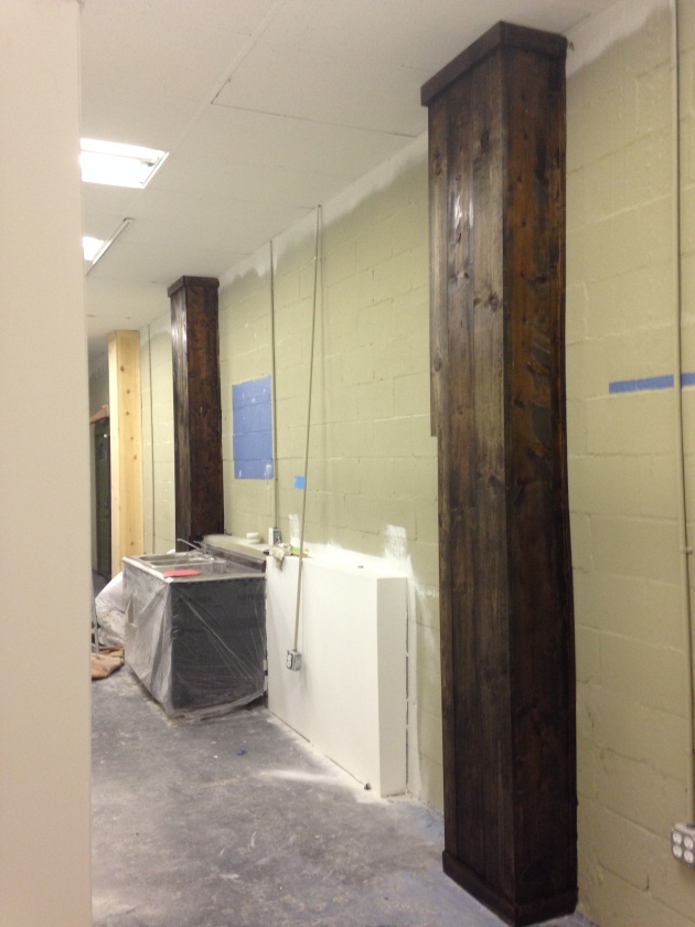
3 out of the 4 offices have a column.

This wall was saying goodbye to the dry erase boards.

After ripping them off, we found that the drywall was in terrible shape and not salvageable.
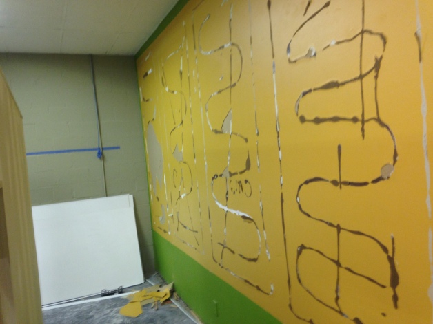
Solution=Shiplap

So fresh and so clean clean.

Another area to figure out was this odd “kitchen” area. They wanted to keep the kitchen so my thought was to remove the upper cabinet, add more lower cabinets and add a backsplash to make it feel more like a real kitchen.

Added lowers.

Backsplash. Now it feels like a real kitchen area as opposed to the weird situation that was happening before.

After all of that was finished, floating laptop bars and lighting were installed. Goodbye fluorescent lighting! In the photo below, the laptop bars aren’t finished yet, but this was the day that my vision was finally coming together. I used the same pendants that I used in the other office and I love the statement they make.
Oh, and here’s the finished painted concrete floors! Love how they turned out.
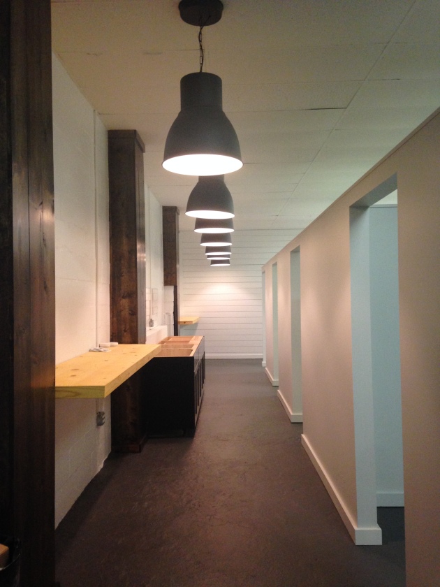

The lighting over the offices. Matte black tracks with bare bulb pendants.Love how it turned out!

A couple of other areas in the office:
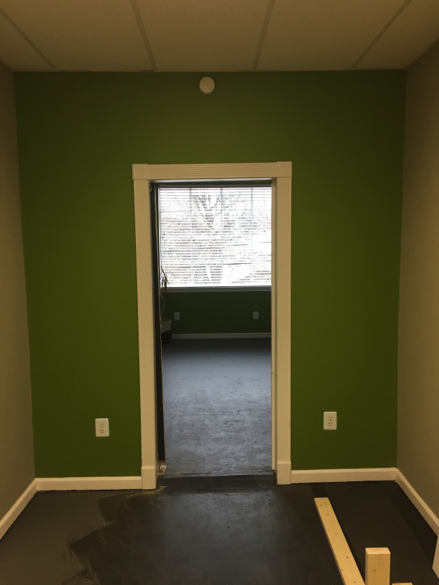
Individual Office- BEFORE

AFTER
Fresh paint, carpet and added wood elements.
Conference Room- BEFORE
AFTER
Fresh paint, new light and wood accent wall.

Hallway- BEFORE (well, after prep work)
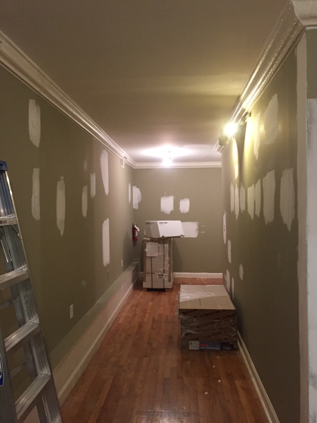
AFTER (pre art hanging, but you get the gist) Freshened up with paint and lighting!

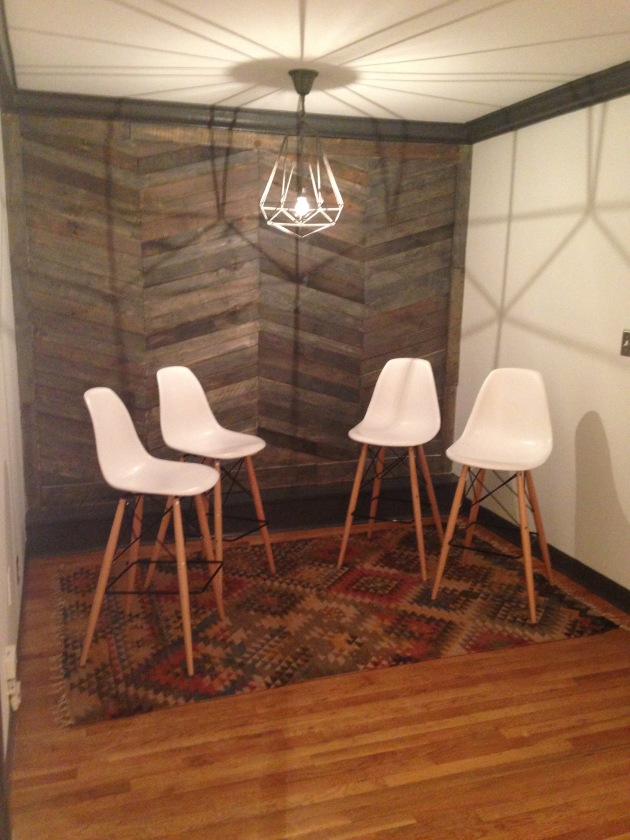
Artist Interview area- BEFORE

AFTER

That’s a wrap!
I am having professional photos taken of this space so I will share soon 🙂
xoxo,
O
The Kitchen is Open
Posted: February 1, 2016 Filed under: My Design, Our House | Tags: before and after, design reno, Home, House Tour Video, interior decorating, Interior design, open concept, slate flooring, Subway Tile, white subway tile 1 CommentFrom the first day we saw our house, I had big dreams for our kitchen. There was only one wall standing between me and an open concept floor plan. It almost took a year of living in the house, but in November while we were on West Coast tour we were FINALLY able to get that wall down and start updating our kitchen. Excited was an understatement!
These were the last photos I took before transformation began:
This is the wall that kept me from an open concept for almost a year. Its days were numbered from the moment we bought the house 🙂

Entry into the kitchen. The only thing we had done at this point was get a new light fixture and paint the walls. It was very closed off from the rest of the house and not much fun to be in.

Same view, but daylight. The only redeeming factor are the big windows above the sink!

This is the wall from the other side.

Phase 1 of kitchen updating included:
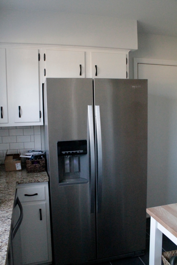
-remove wall (which is where the refrigerator was before which meant we had to find a new spot for it, so we decided to cut the cabinet and countertop off and put the fridge where it looked like it always belonged)
-new flooring
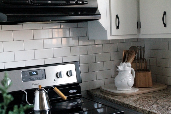
-subway tile backsplash
-new appliances
We would love to get new cabinets and countertops, but that will be in the future.
All of the work was being done while we were out of town so our contractor sent us photos of the progress.
First step, cut countertop and cabinet where the fridge will move to:
Believe it or not, this small amount of progress got me super excited for the new kitchen layout!!

Next step, remove the wall and make an opening.
When I got this picture I literally screamed because I was beyond excited to finally have an open concept!
View now standing in the kitchen facing the living room. We can see to the front door now!! Woohoo!!

Next step, which proved to be the most stressful, was the flooring. When they pulled up the old floor there was a not-so-pleasant surprise underneath….
Completely rotted/moldy subfloor!!! (this was NOT a fun picture to get)
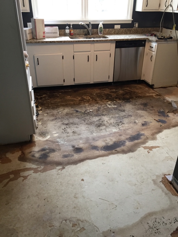
I’m really glad we weren’t there because the contractor said the smell was unbearable! EEK!
So the original plan was to rip out old flooring, apply cement board and lay new tile. Simple right? Well, plans changed when the rotten floor was revealed, so they had to demolish the subfloor all the way down to the joists!! $$$ (the joys of updating an old house)
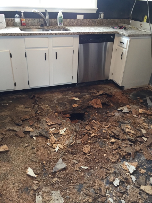

Getting these pictures while being out of town was definitely not fun, but we were just glad to know the mold was gone and a brand new subfloor was going in.
New plywood subfloor was laid and then cement board on top of that. Things were starting to look up 🙂

We got home from being gone 2 weeks and the very first thing we did was prime the walls because now that the kitchen was open to the rest of the house we wanted it to look cohesive.

Ready for some pretty photos now??
View in living room now!! A million times better!!!

Before:

After:
Before:

After:

Before:

After:
I was so happy to get rid of the laminate orang hued fake hardwoods and replace with these beautiful tile floors!


We needed some extra storage/counter space since we lost some when we moved the fridge. This little IKEA cart did just the trick. It’s the perfect size and look for the space!

Subway tile will always be a favorite of mine. It’s just classic.
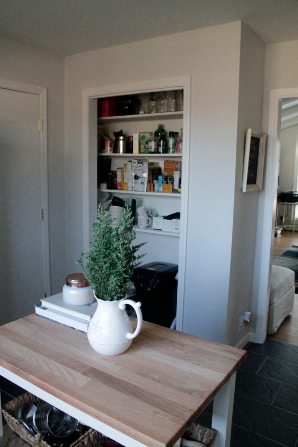
We took off the old bifold pantry door. Still need to get a cute curtain or something to hang, but for now it’s open and I don’t mind it 🙂
View from kitchen to dining area.

We are so happy with how everything turned out! It’s like that wall was always supposed to not be there! 😉
Our next project is our garage that’s not used as a garage anymore. I will be sharing that process as it happens!
Thanks for stopping by!
xoxo,
O
The Wheels on the Bus: Part 2
Posted: December 29, 2013 Filed under: Design Inspiration, Projects/Crafts | Tags: Bus, Materials and Supplies, Restoration Hardware, Subway Tile, tour bus, tour bus design, Wood and Plastics, Wood finishing 2 CommentsThe bus is finally finished!!! Yep…finito, done, complete! It has been a long process, but I am so happy with the way everything turned out.
This bus is occupied by 12 men at all times so I had to design accordingly. My thought process for the design was the feel of a luxury hotel that is neither masculine nor feminine, but nice, clean, simple and luxurious. I chose the dark wood finish first then the leather, flooring, fabrics, etc.
Have a look at the finished product!
This is the front lounge.

The view you get right when you walk on the bus.

Detailed shot of the only patterned fabric I chose and one of my favorite things on the bus…the sconces from Restoration Hardware complete with Edison bulbs.


I love the gray barnwood-esque floors against the camel leather couches, chocolate brown walls, and amazingly soft fur pillow!

The kitchen area is definitely one of my favorite parts of the bus. You can never go wrong with white subway tile and charcoal gray grout 🙂


The bunk area was hard to photograph because there is no natural light, but here it is. I chose a gray check sheet with a soft, navy blue pintuck comforter. Ignore the creases in the sheets 🙂


The back lounge:

The shower: Once again I chose subway tile, because its my favorite, with a hexagon carrera marble floor.

And one more look at the front lounge.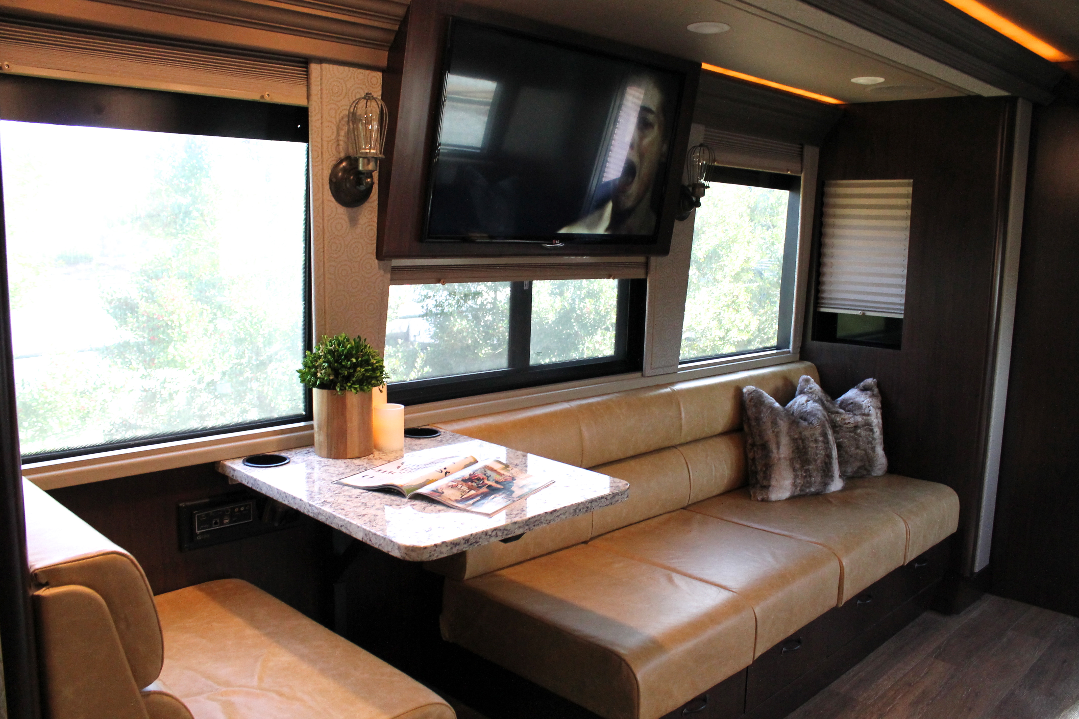
Well, that sums up the bus tour. I hope you liked it! I’m so glad I was given the opportunity to do this project and can’t wait for what’s next 🙂
Thanks for stopping by!
xoxo,
O
