
Office Project- Before & After
Posted: December 19, 2018 Filed under: Design Inspiration, My Design Leave a commentI designed this office space almost 5 years ago and since then I have done quite a few offices. Seriously, I’ve done more offices now than I ever would have imagined.
I really love creating fresh, modern work spaces for people. Who says your office has to be blah with fluorescent lighting? Not me.
Here are some before & afters of the office I wrapped up this past weekend.
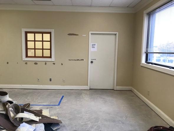
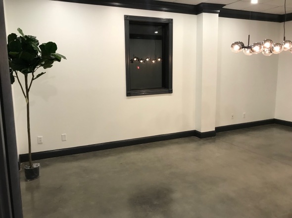
Lobby area BEFORE:
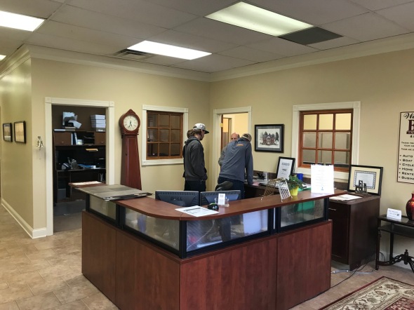
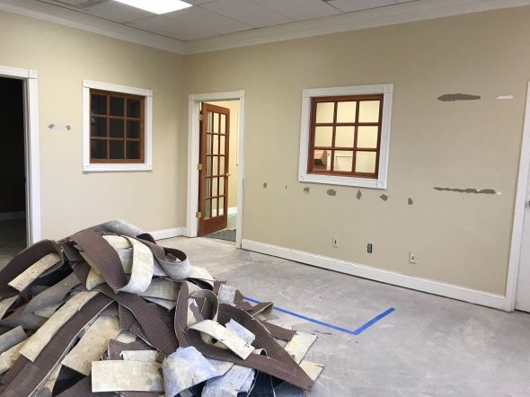
Progress of old flooring ripped up and getting ready for fresh concrete to be stained. I also decided to patch up those two interior windows because they just make the space feel dated.
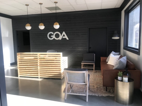
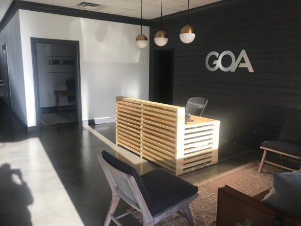
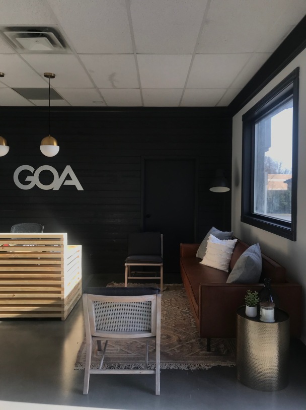
AFTER:
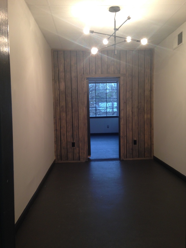
After closing off the window on the back wall it became a great spot for a feature. Shiplap painted dark gray for the win! Doing a smaller scale desk and hanging pendant lighting over it gives it a clean, fresh, more spacious feel.
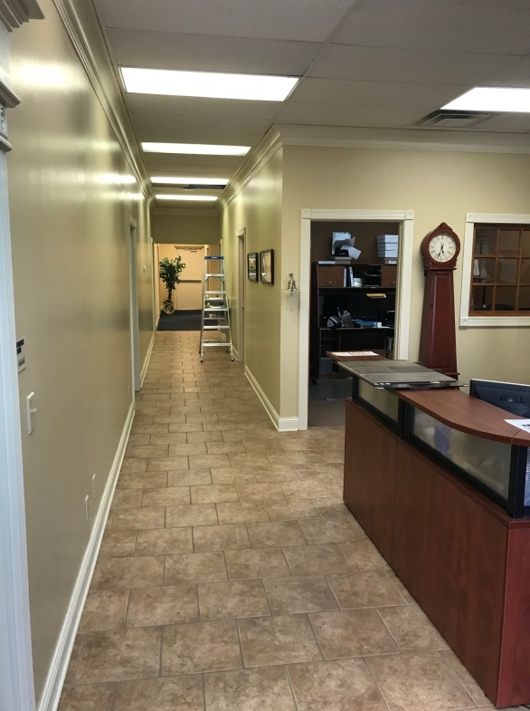
BEFORE:
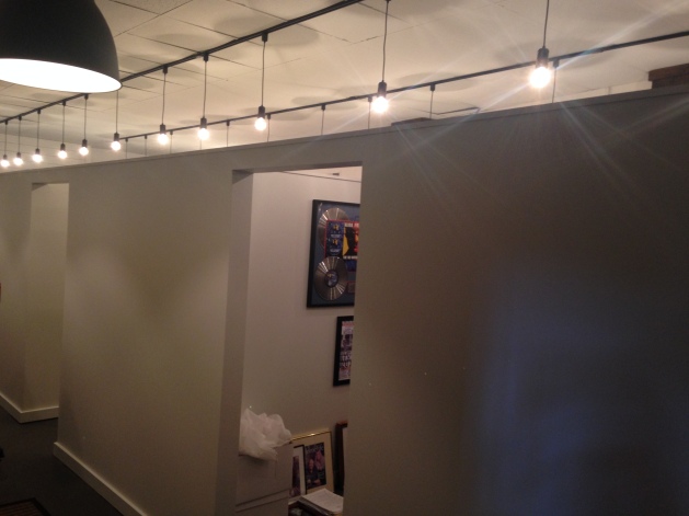
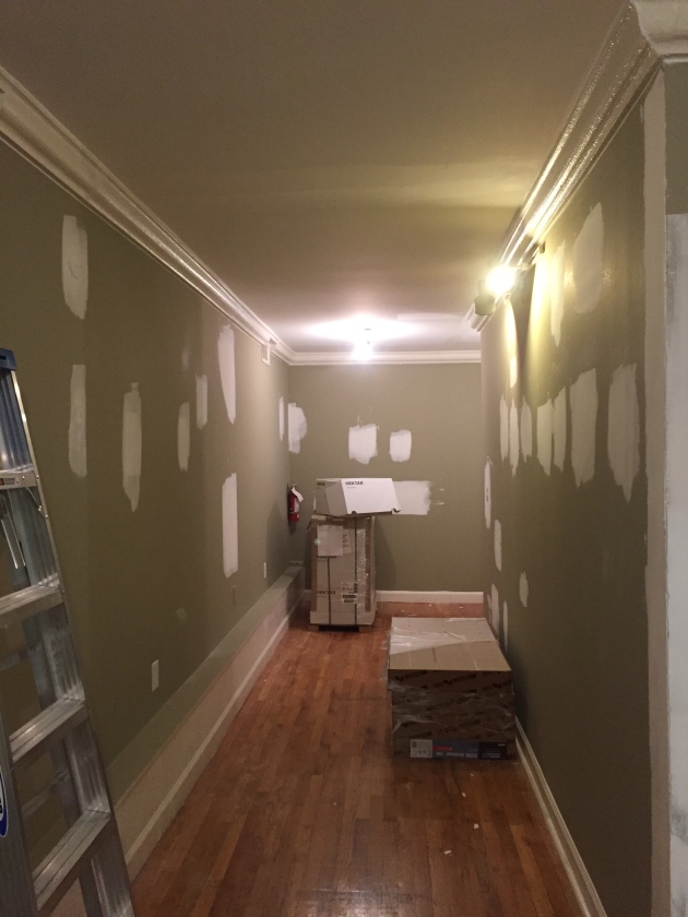
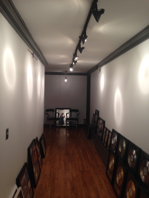
The hallway was filled with fluorescent lighting and a blah paint color.
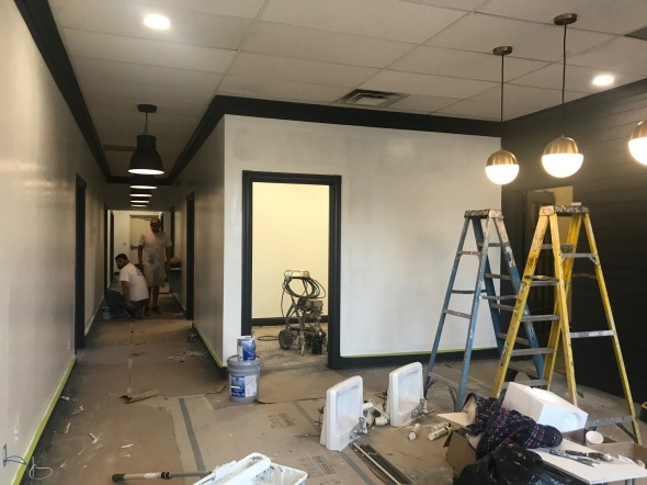
PROGRESS:
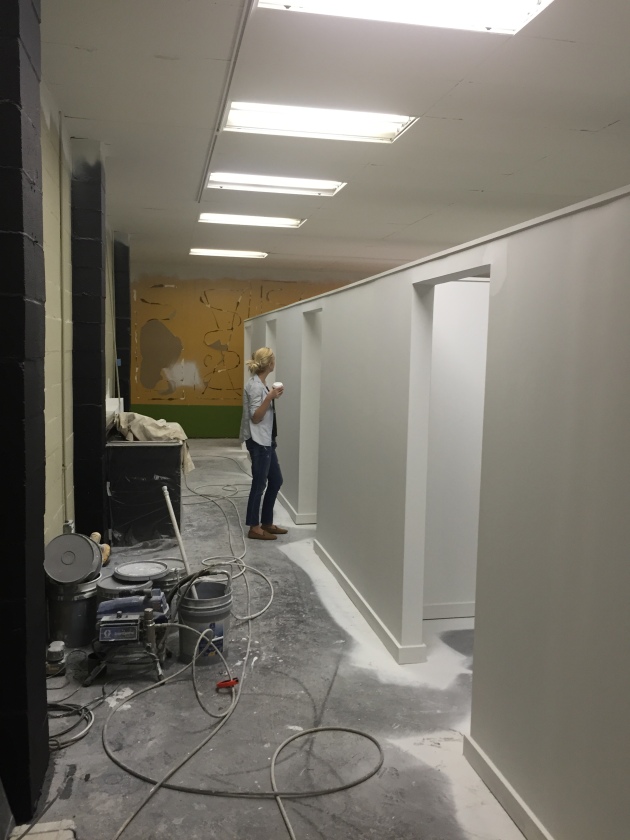
We removed the fluorescent lighting, added my favorite industrial pendants from Ikea, painted the walls a crisp white and the trim a dark gray. I don’t have the full after photo for the hallway yet because I am getting some prints framed to hang, but I will add it in later.
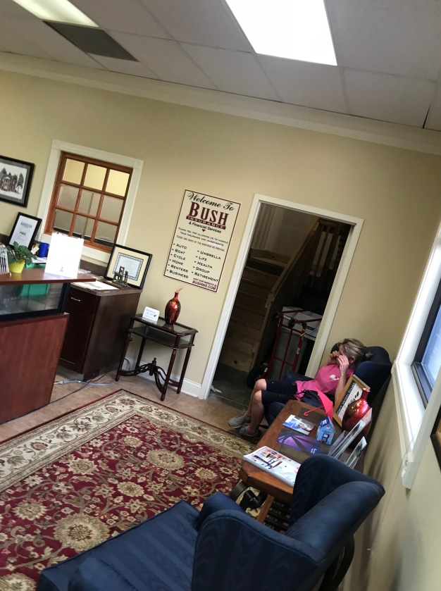
Sitting area in the lobby BEFORE!
PROGRESS
ATER:
Simple, functional and not crammed feeling at all. The saddle leather couch really steals the show for me 🙂
Here’s the angle looking back from the hallway:

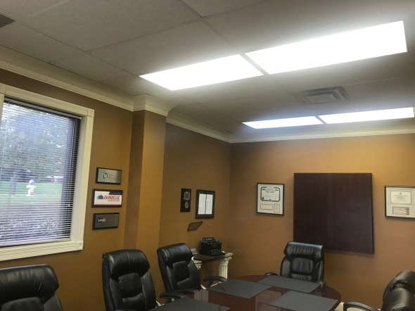
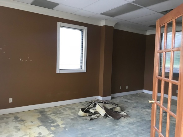
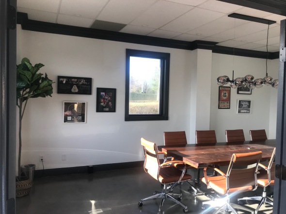
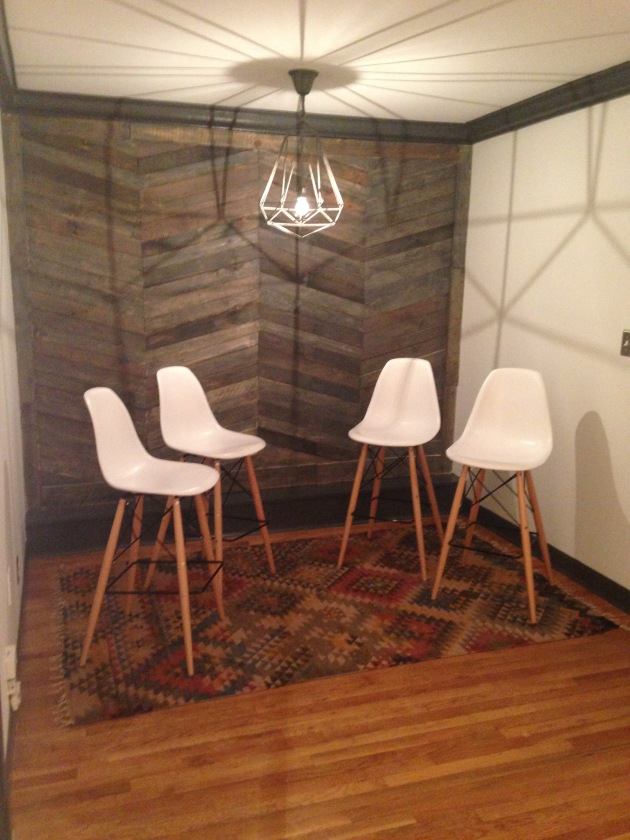
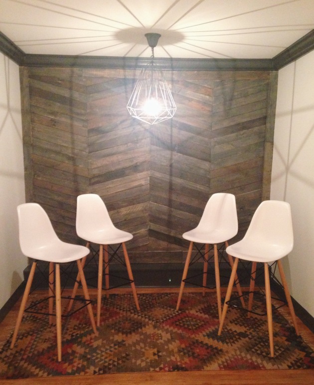
Conference Room BEFORE:
Nothing says let’s have a meeting like fluorescent lighting and an interesting shade of brown walls. Haha!
PROGRESS
AFTER:
Fresh paint, lighting and stained concrete flooring gave this conference room an entirely new feel!
I wouldn’t mind meeting in here now 🙂
Not pictured were 7 individual offices, 2 bathrooms and a space with more cubicle style work areas. I don’t have photos of everything to share, but I thought I would share the highlights!
Another fun office project in the books. Working on another one as I type this. Cant wait to share!
xoxo,
O
Goodbye Garage- Paint it White
Posted: April 10, 2017 Filed under: My Design, Our House | Tags: before and after, design, garage, Home, home renovation, Interior design, interiors, Paint, progress, renovation, transformation Leave a commentToday, I am sharing our freshly painted white garage/multi use space..woohoo!!!!
Lets take it wayyyy back to the ‘before’ of how the garage looked for the last 2 years:
And the trim post from last week to refresh your memory:
And now for some prettyyyyy!!
I decided to go with one of my absolute favorite white paints by Benjamin Moore- White Dove for pretty much every surface except the ceilings are BM- Decorators White. We had these simple desks made and added the gorgeous pendant lighting over each. I love the punch that they add to the space!
Another angle before paint:
After paint:
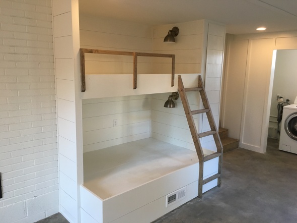
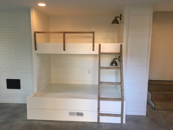
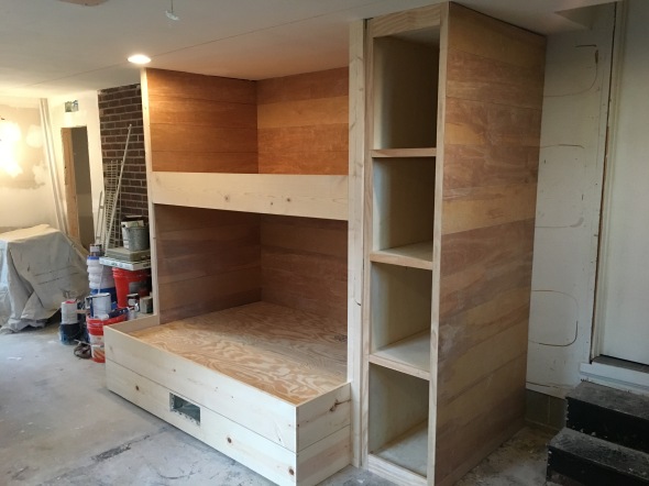
I wanted the rail and ladder to contrast against the white so I went with a minimax stain in weathered oak and I love how it turned out. The sconces are a simple style in a muted brass.
Another bunk shot, before the rail/ladder/cabinet door:
After:
Angle looking back towards laundry area before:
After:
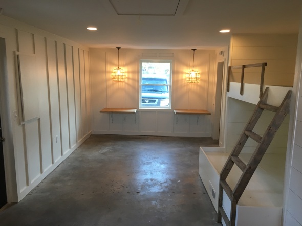
Door color- BM- Wrought Iron
One more bunk shot before:
After:
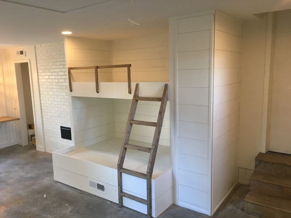
I LOVE how it turned out and how fresh and clean it feels now! We said before we started this project that we probably will wonder how we lived without it and that is totally how we feel. It’s just so nice to have 500 extra useable square feet!
It may take a while to furnish the space because we need to start focusing our spending on baby girl’s nursery, but I am just so pleased with how it looks now freshly painted and clean!!
Thanks for stopping by!
xoxo,
O
Goodbye Garage- Trim it out
Posted: April 3, 2017 Filed under: My Design, Our House | Tags: before and after, design, garage, home renovation, Interior design, interiors, progress, renovation, transformation Leave a commentHey guys!
Next up on the garage renovation…trim!!! I loveeeee rooms with added trim detail. It just gives that extra punch that takes a wall from basic to interesting.
There are many different trim styles you can incorporate in a room, but for our space I knew I wanted to do a classic board and batten. Board and batten can be done several ways…half way up a wall, horizontal, square & vertical. Here are a few inspiration photos:
Square-
Horizontal-
Vertical-
I decided that vertical was the winner for the space. Now for some photos of the trim installed!!
I just love the detail that it adds to the space. We could’ve just left the drywall and painted it, but I knew that adding the board and batten would really help finish it out and take away any remnant of it feeling like an old garage. Now all it needs is fresh paint!!! My motto for everything…paint it white! Ha.
Can’t wait to share photos of the paint and lighting installed. I’ll be sharing soon!
xoxo,
O
Goodbye Garage- Concrete Floors
Posted: March 21, 2017 Filed under: My Design, Our House | Tags: before and after, creative space, design, garage, Home, home renovation, interior decorating, Interior design, interiors, modern, progress, renovation, transformation Leave a commentHey guys!
Today, I’m going to share the flooring situation in the garage. If you noticed in the pictures in my previous post they are just your typical concrete floors you would find in a garage.
Here’s a pic to refresh your memory:
Our only two options for flooring were tile or refinishing the concrete. Well, we quickly decided to go with refinishing the concrete for budgeting purposes. Definitely the most cost effective and I actually really like the look of stained concrete floors.
Here are a few inspiration photos:
I like the gray tone, matte finish and clean/modern look.
We hired a concrete company to come out and tell us our options.
Option 1- clean, pour an overlay of two coats of concrete to smooth out any imperfections, stain and seal. $$$$
Option 2- clean, no overlay, seal and stain. $$
We decided to go with option 2 because we need to save anywhere we can. I’ve got a nursery to do here…haha!!
The guys came in, cleaned & stained one day and came back the next day to seal. The floors had to cure for 2 days which meant no walking on them, but we were out of town so it didn’t matter. They actually got 4 days of no walking so they were extra cured. 🙂
Because we opted out of the overlay to save money, you can still see imperfections in the concrete, but it doesn’t bother us and there will be rugs to cozy it up.
After:
If money hadn’t been an issue we would’ve done the overlay or maybe even tile, but working within our budget, this was the best option and I’m pleased with the outcome! I like the gray tone of the stain and the clean/modern look.
Next up, TRIM!! In my next post, I will share the trim work I knew I wanted to add for that extra punch. 🙂
Can’t wait to share more progress!!
xoxo,
O
Goodbye Garage
Posted: March 13, 2017 Filed under: My Design, Our House | Tags: before and after, bonus room, bunk beds, creative space, design, garage, Home, home renovation, Interior design, interiors, progress, renovation, shiplap, transformation Leave a commentToday, I’m sharing our latest project on our house. The old garage is getting transformed into a “multi-functional creative space”…at least that’s what I like to call it. 🙂
When we bought our house the garage was not a useable garage anymore. The previous owner had closed it off, leaving paneling on the exterior of the house.
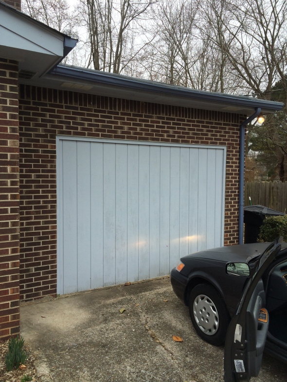
No bueno. Ha! We knew we were going to be getting the brick painted and wanted to remove the paneling and add a window so that once the house was painted, it would look like it was always part of the house and not an old garage.
Here’s how it looks now.
The exterior was complete, but the inside of that previous garage was our laundry room and also straight up junk room.
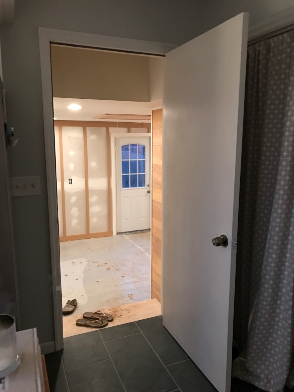
This is the door inside the house that leads to the garage. We have plans to do a cool antique door here.
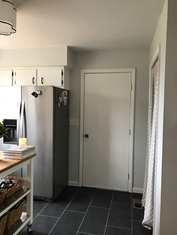
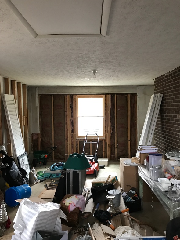
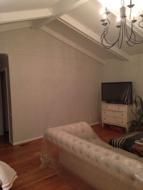
Now entering the junk pit…haha! I cringed every time I opened the door to do laundry.
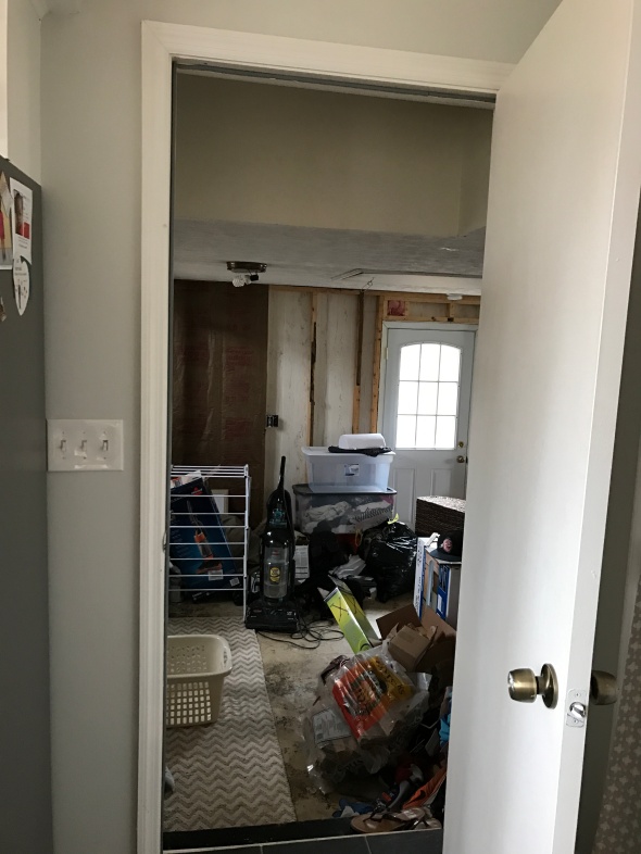
This is how it looked for the 2 years that we’ve owned the house. It was the “close the door quick, out of sight out of mind” sort of thing.
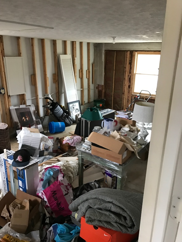
I had been dreaming of the day when we could get all of the crap cleaned out and turn this old garage into a useable space. Well, with our baby on the way and needing to free up a bedroom for the soon to be nursery, Stephen’s music room needed a new home, so now was the time to start on this project. Woohoo!! Thanks baby Carswell 🙂
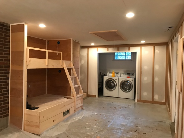
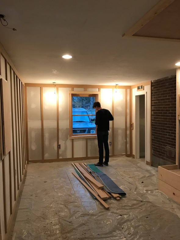
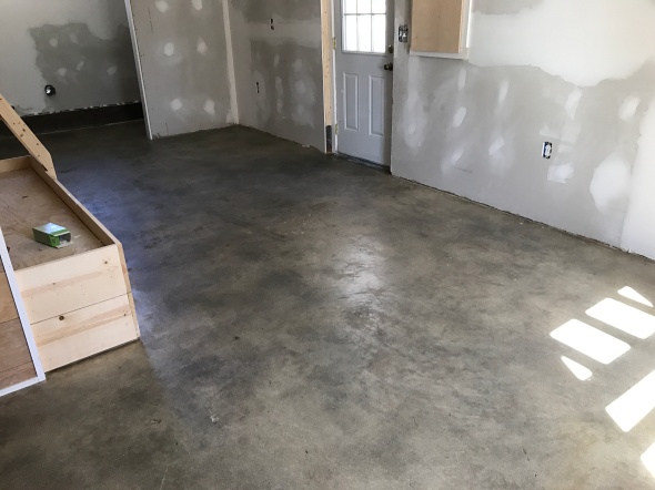
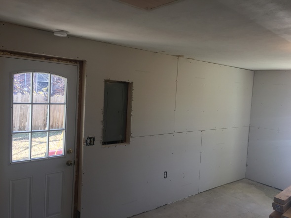
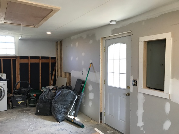
We hired someone to do the majority of the work, but the first step was cleaning out all of the junk that accumulated over the last 2 years. Once it was cleaned out, the old paneling was ripped out, the ceilings were sanded and new studs, insulation, electrical & drywall were added.
Ahhhh, finally starting to feel like a room!
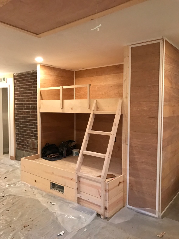
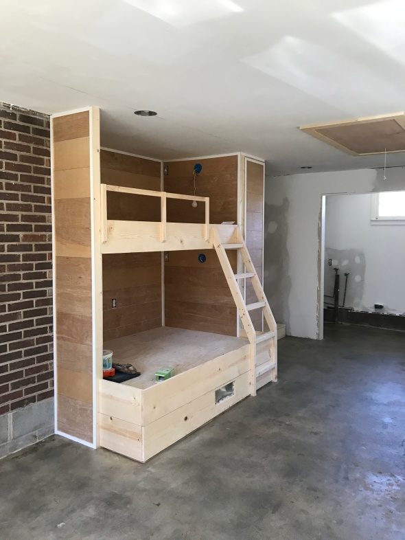
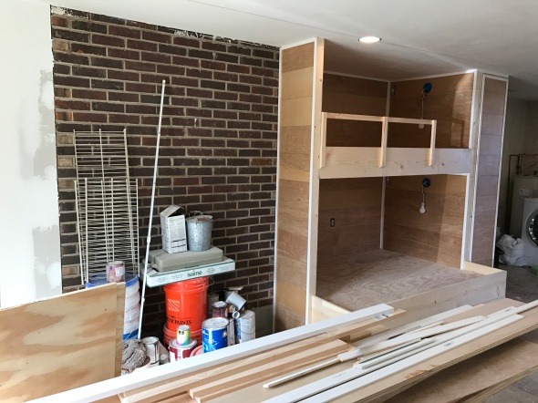
The wall to the right of the brick is where I knew I wanted some sort of custom built in bed. I threw around the idea of a murphy bed, but ended up going with built in bunk beds.
This is the area for the future bunk beds.
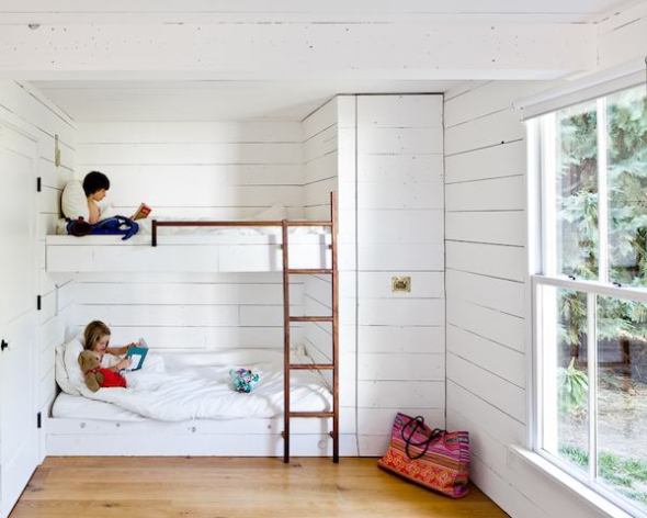
I had a few bunk bed looks I really loved, but ended up landing on this photo for my main inspiration.
I love the simple & clean design, as well as the built in storage of these bunk beds.
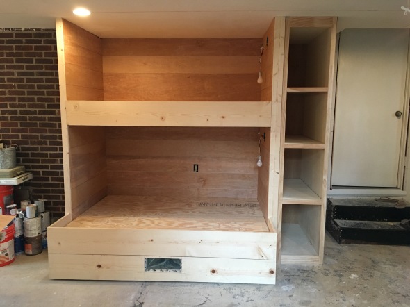
Bunk bed progress:
We decided to do a twin bed for the top bunk and a full bed for the bottom bunk for extra sleeping space.
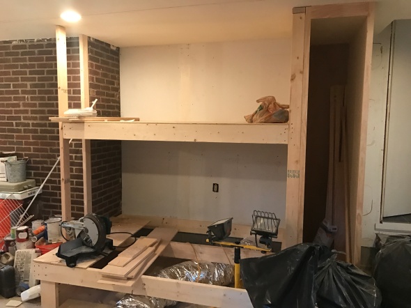
Stephen testing out the bunks. We also added a closet to the left of the brick for Stephen’s music gear.
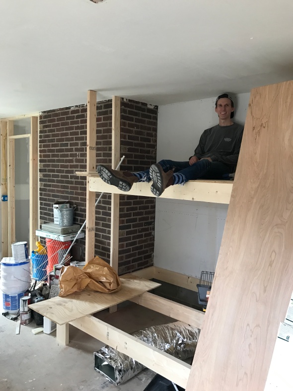
Looking more and more like bunk beds!! Yay! Can’t wait for these to get painted.
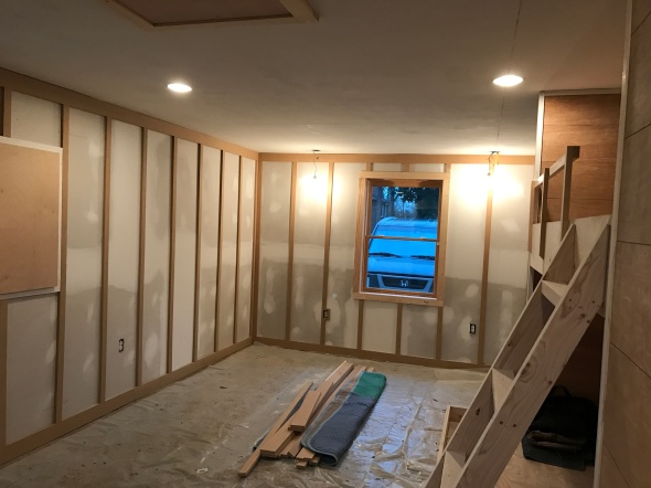
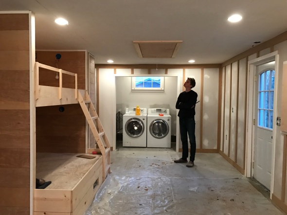
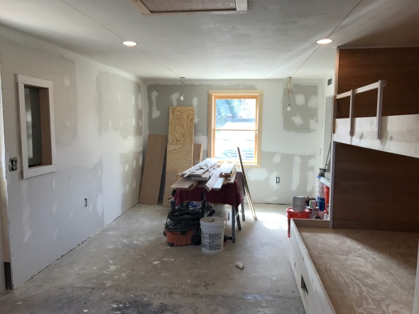
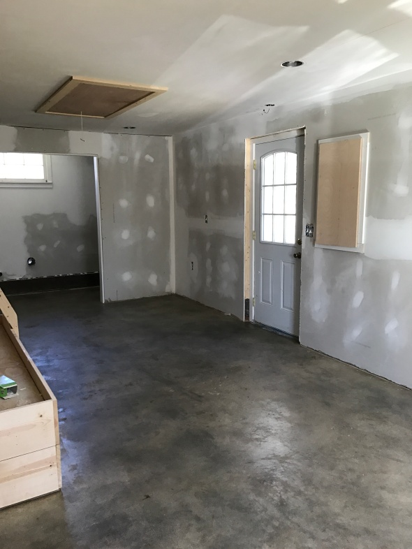
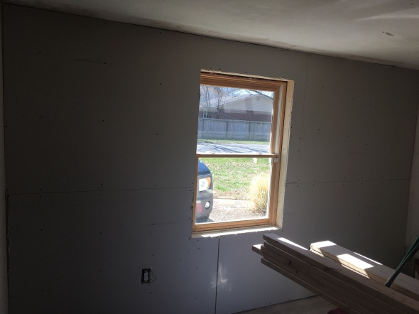
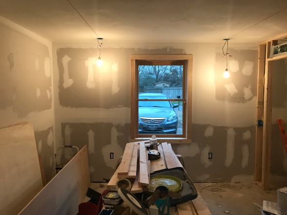
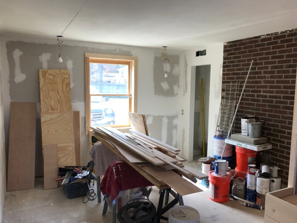
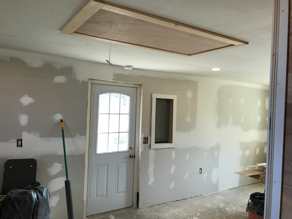
For the wall where we added the window, I knew I wanted to do floating desks on either side of the window with pendants above each desk. The desks won’t be installed until after paint, but here is the window trimmed out and added lighting for the pendant fixtures.
Here’s more of a room shot with the added railing to the bunks.
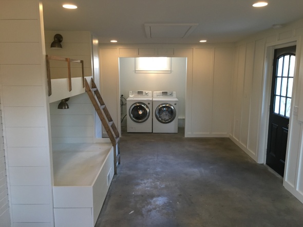
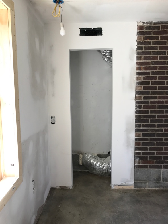
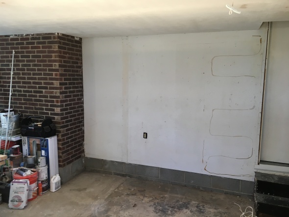
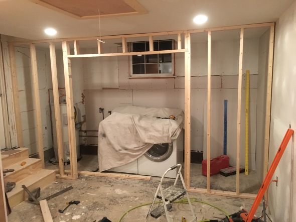
The opposite side of the room is where the washer/dryer is set up. Now, I REALLY wanted to add a full bath, but the plumbing cost was insane so we had to nix that idea pretty quickly :(. Instead, we just framed out a laundry/storage room.
How it looked the last 2 years.
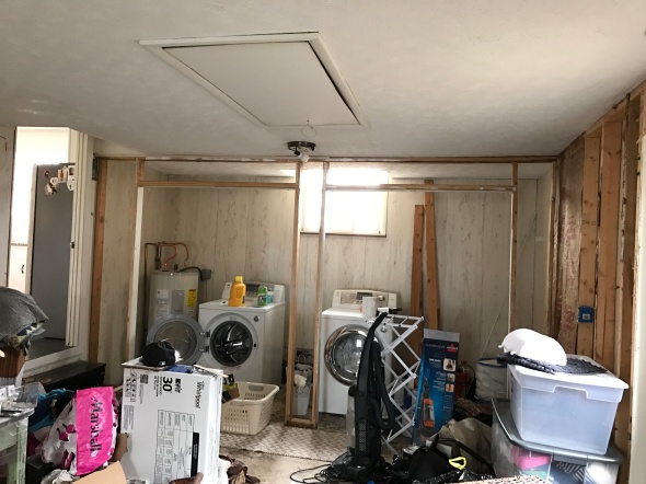
We had that old framing knocked down, centered the washer/dryer under the window and added new insulation and drywall. We also had new stairs built leading back into the kitchen.
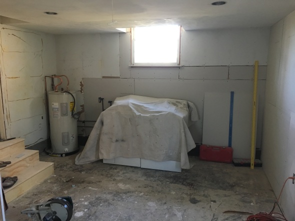
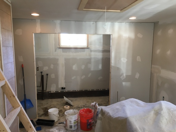
Inside of the laundry/storage room. We plan to add some shelving on this wall to better utilize the space.
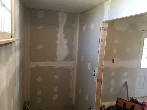
Now the water heater is out of sight!! Yay!
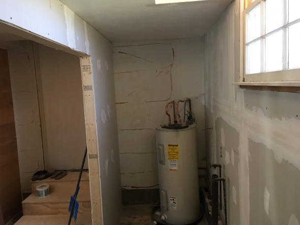
A few more angles.
Can’t wait to continue to share the progress! It has come a long way, and still has a ways to go, but I am super excited about the progress so far.
Thanks for stopping by!
xoxo,
O
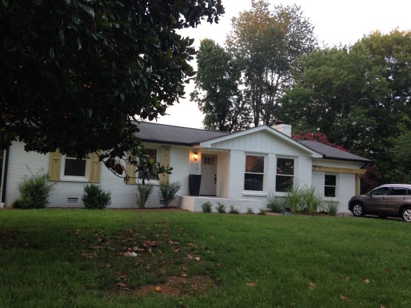
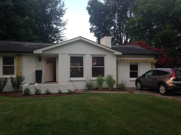
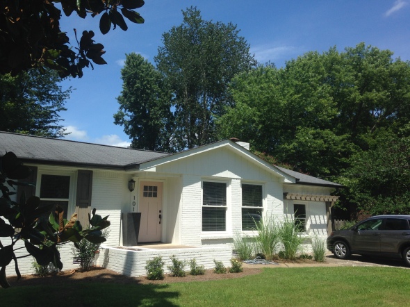
Layering the Exterior
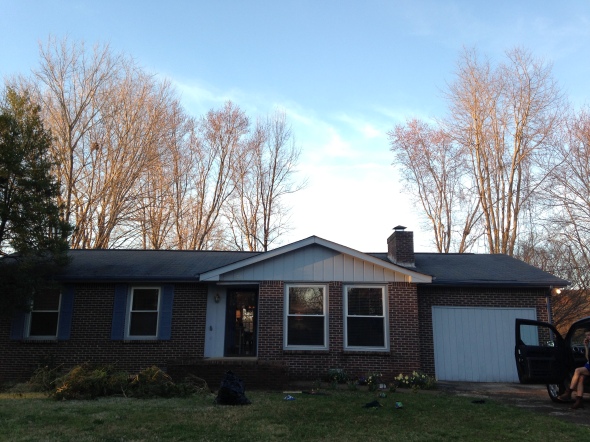
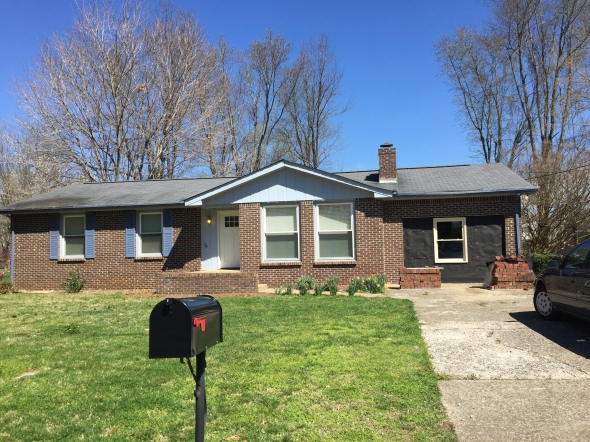
Posted: November 18, 2016 Filed under: My Design, Our House Leave a commentThe exterior of our home has gone through quite a few phases since we bought it.
Here’s what the exterior of our house looked like from November (when we bought it) until April when we started making some updates.

Next step was cutting down that tree on the far left, getting a new front door & removing the paneling on the far right and installing a window. We took a few steps in the right direction.
The next BIG update was painting the whole exterior white!!! The existing shutters & gutters came down and everything got painted! WOAH! Big difference
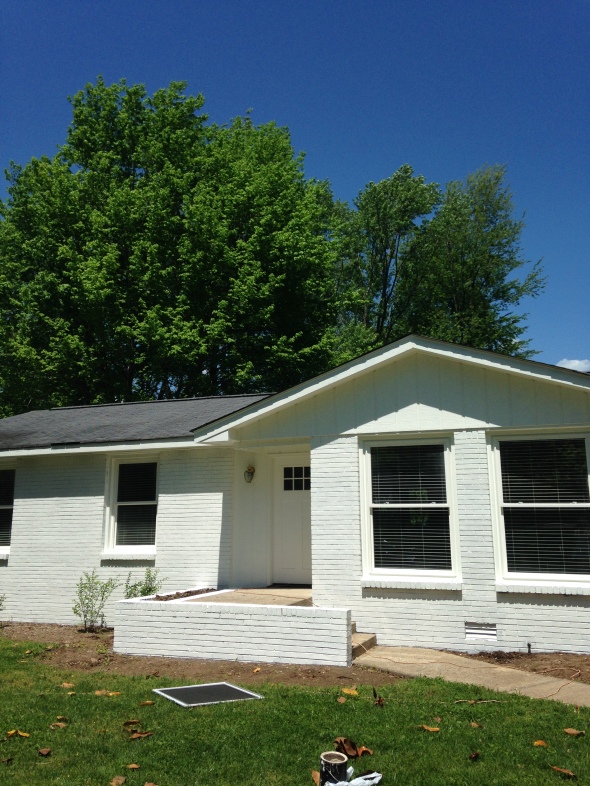
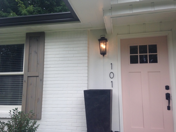
Next up: new dark gutters for contrast, house numbers & light fixture and front door color. It looked like this for almost a year. We knew it needed another layer, but had to wait for our funds to replenish.
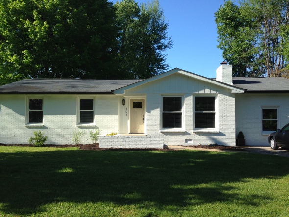
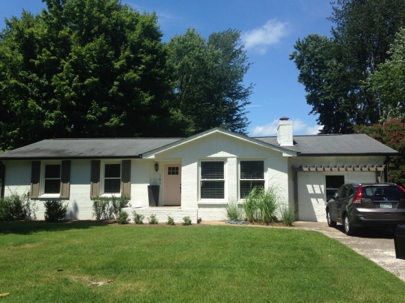
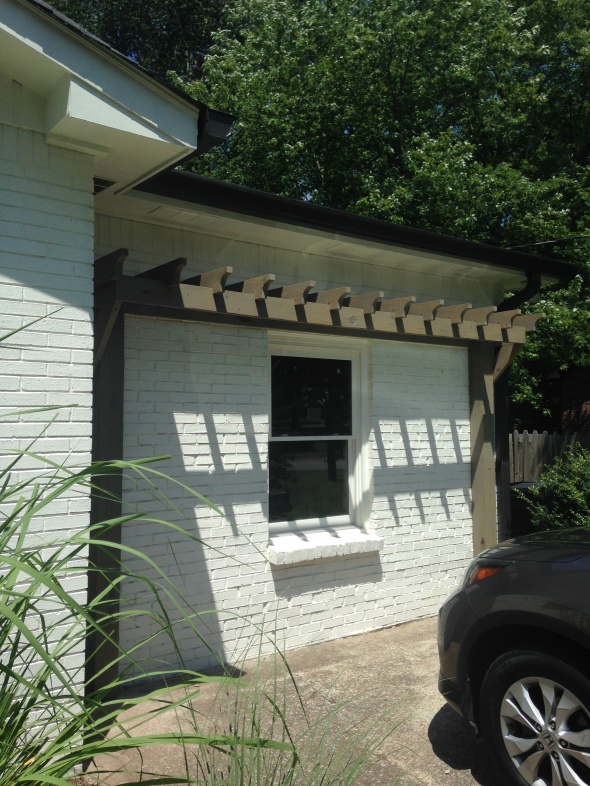
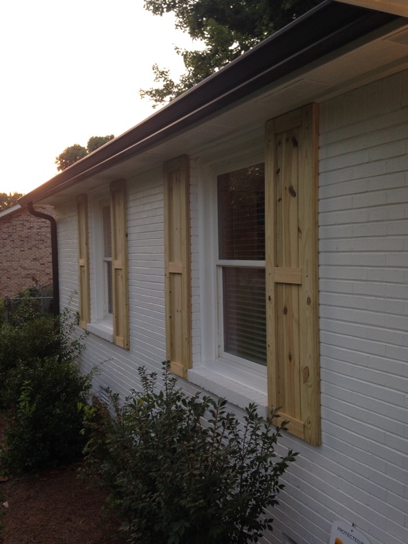
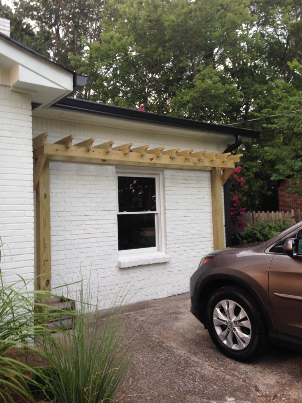
As soon as the next Spring rolled around, we had shutters and a pergola made. This is what I had been waiting for…that next layer to make the exterior feel complete.
Shutters up close
Pergola up close
The wood had to stay in its raw state for almost a month for the chemicals to keep it from rotting to soak in. While that was taking place, I was debating about new colors for the front door for a pop of color. I narrowed it down to 2 colors…blue or blush pink.
This was the contender if I went blue: BM Wythe Blue
I love how its a subtle bluish/greenish/grayish, but makes a statement.

After going back and forth for a few days, I asked Stephen his opinion. Surprisingly, he was on board with blush pink…woohoo! Every girls dream 😉
Saying goodbye to beige
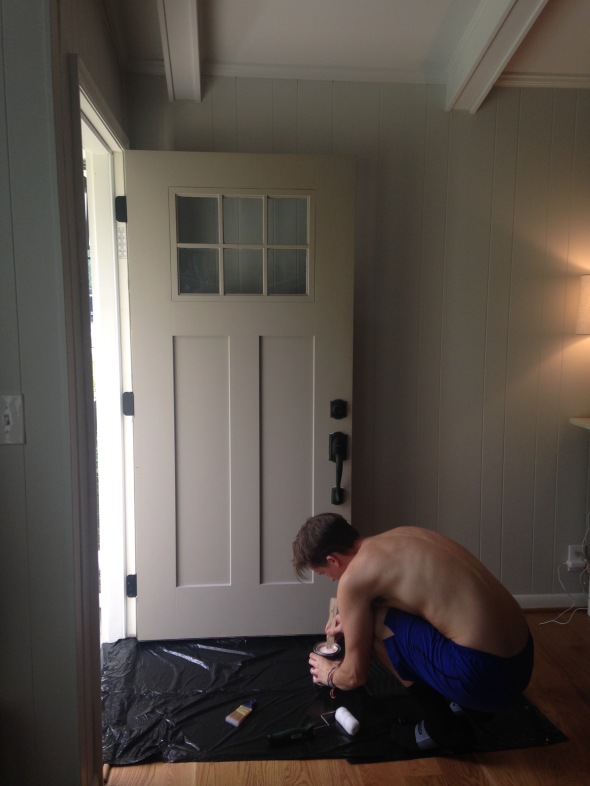
And hello to blush 🙂 It’s a very subtle blush tone which is perfect!! It’s BM- Odessa Pink. I definitely recommend it!
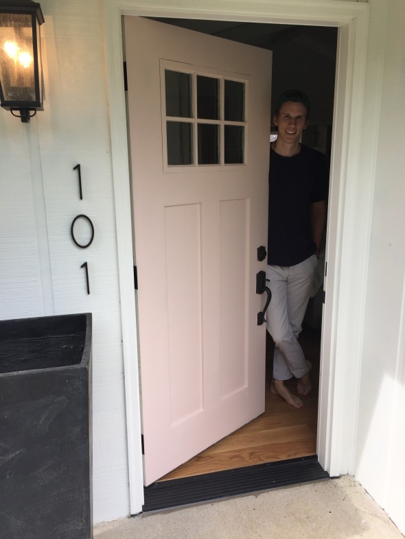
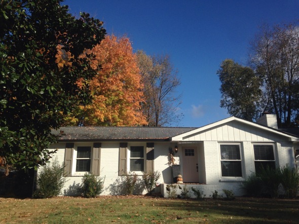
I love how happy it makes our house look and in the Spring it’s a nice pairing with the pink tree beside our house. 🙂
After the month of letting the wood cure, it was time for a stain. I knew I wanted something in the gray family.
I’m really pleased with how it turned out!
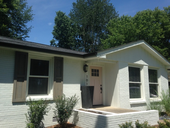
This is how it’s looking these days with the help of Fall leaves 🙂
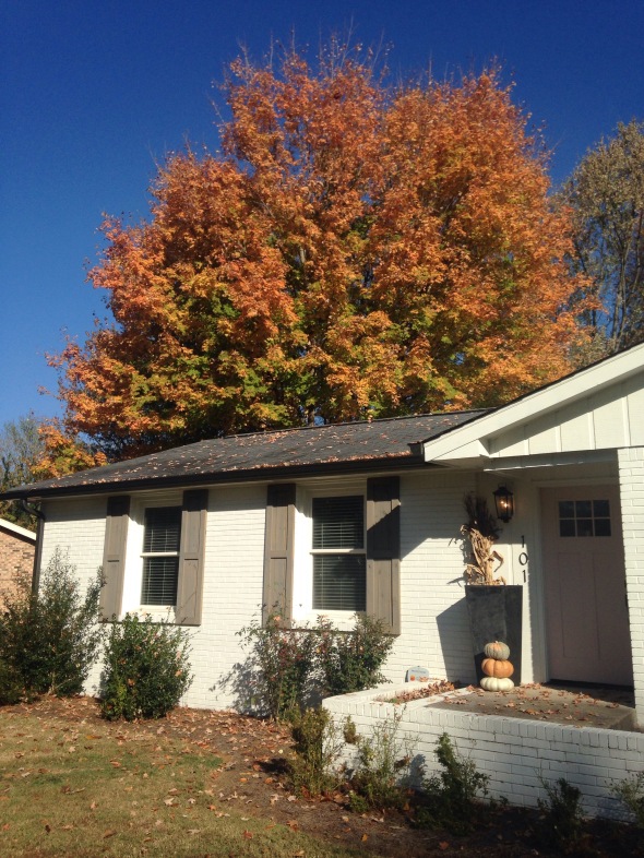
Why not one more before and after 🙂
Before:
After:
There is still A LOT of landscaping that needs to be done, but we are pleased with how far its come.
Thanks for stopping by!
xoxo,
O
Master Bathroom Remodel
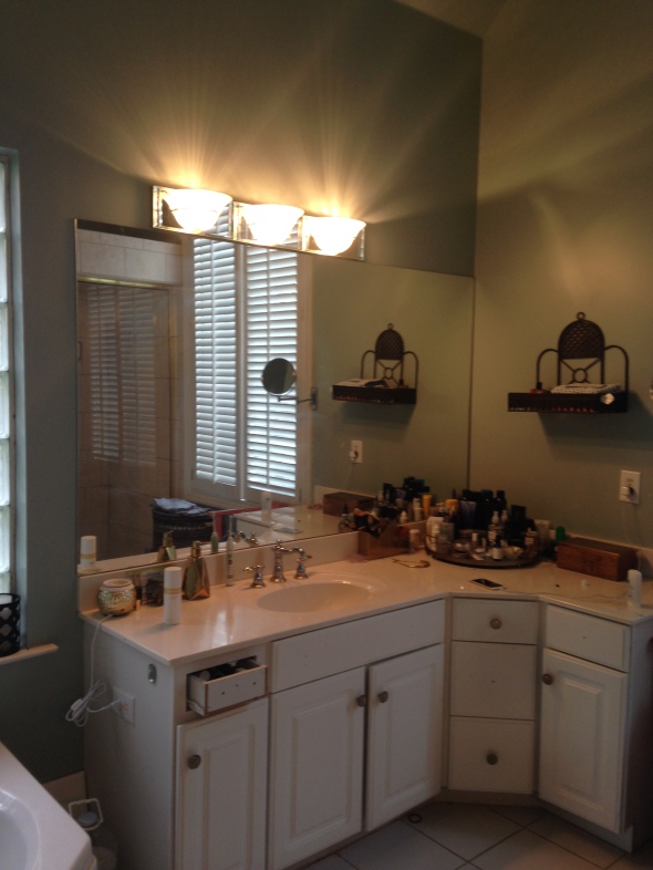
Posted: November 6, 2016 Filed under: Design Inspiration, My Design | Tags: bathroom remodel, before and after, design, Home, home renovation, Interior design, interiors, master bathroom, modern, renovation, transformation Leave a commentLast February, I had the first meeting with my client for a master bath remodel. It was your basic late 90’s/early 2000’s bathroom. Jacuzzi tub, cubed window, whitewashed cabinets… My client had a great budget and was on board with a full gut of the bathroom. Just what you want to hear as a designer 🙂
After walking through the bathroom and talking with my client about their wish list, the designing began.
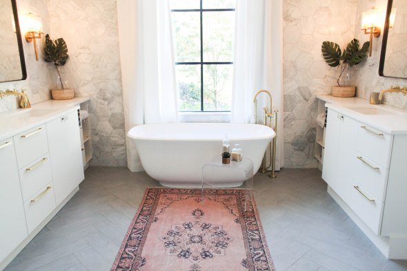
Client wishlist: free standing tub, steam shower, his & hers vanities and plenty of storage.
My design wishlist: marble, brass, modern/boho vibe, luxurious, relaxing/spa like
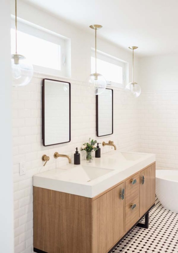
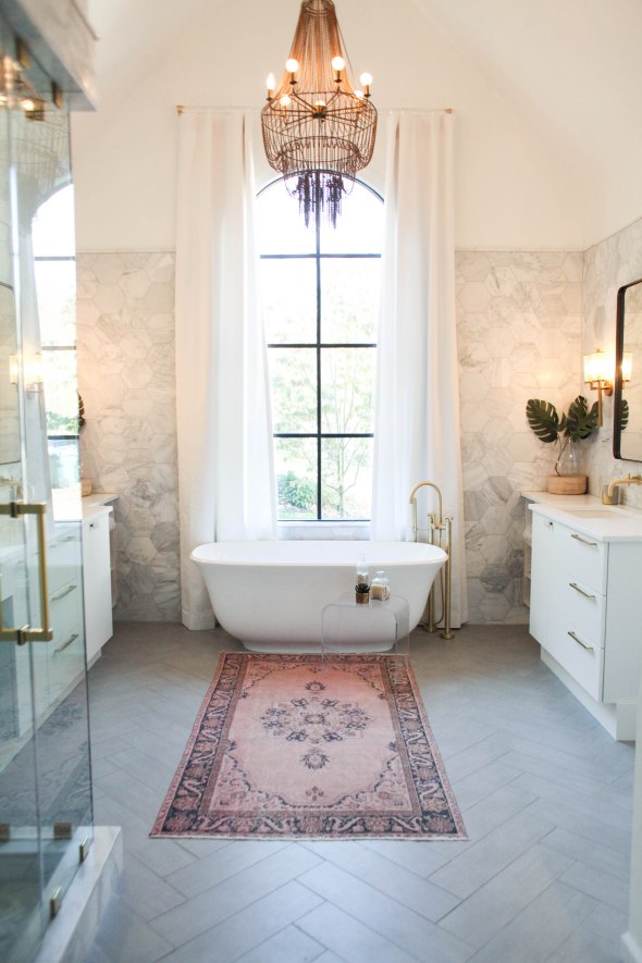
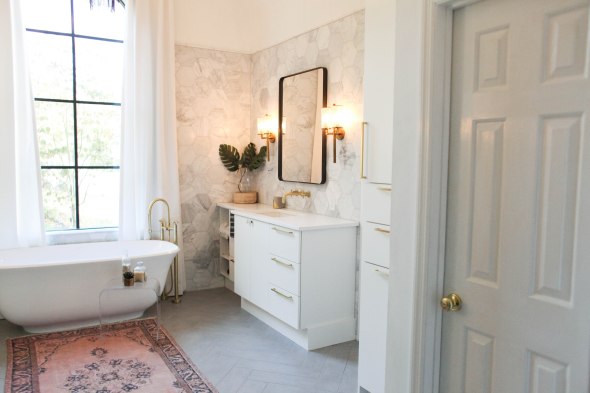
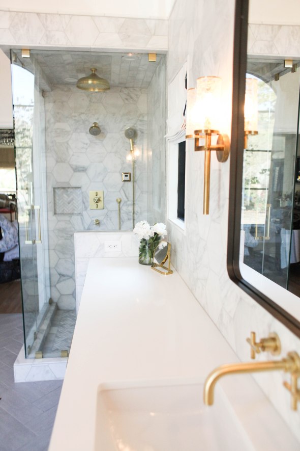
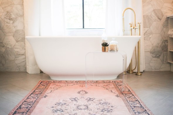
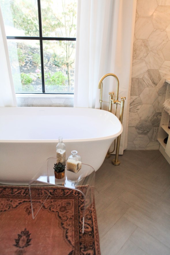
When designing a bathroom, I like to start with the tile first. I found this 8 inch marble hex that I LOVED and knew it was going to be the showpiece of the space. I wanted the hex to cover every wall and I chose a 12×24 ceramic gray tile laid in a herringbone for the floor.
After nailing down all of the tile, next up was the plumbing fixtures and finishes. I went with brass and modern fixtures. After tile & plumbing fixtures, next up was the layout. Since this was a complete gut, I was basically working with a shell so I could pretty much do whatever I wanted with the layout.
Here are a couple of inspiration photos:

Now for some photos of the bathroom…
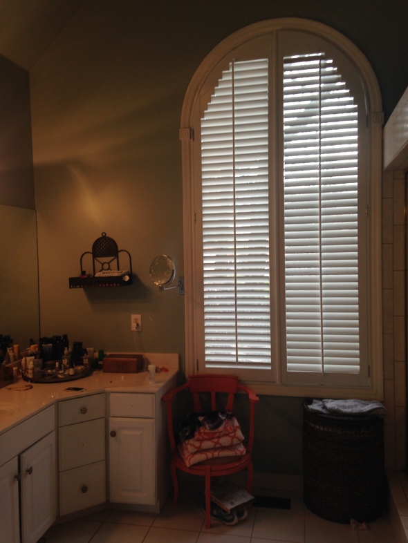
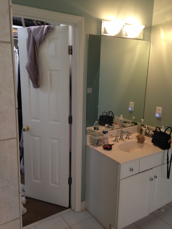
Before:
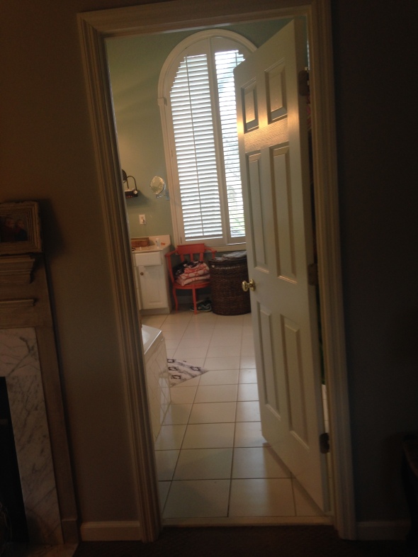
To the right of the window was the old steam shower:
To the left of the window was her vanity:
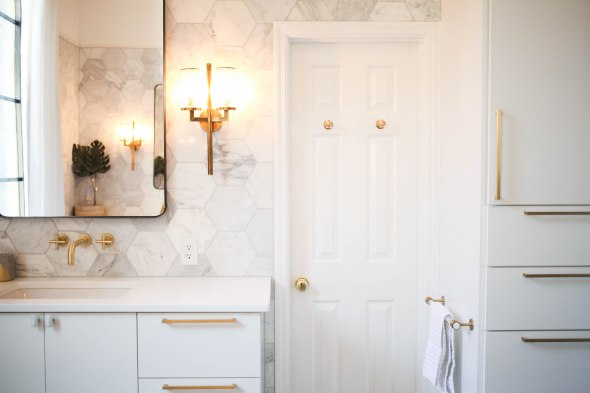
The window got quite the facelift. We removed the plantation shutters and added/painted the trim work black to resemble the look of a steel window.
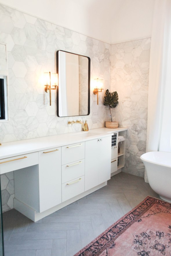
Here’s the after:
Her vanity area before:
After:
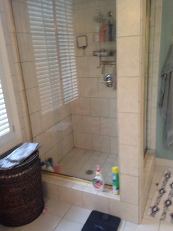
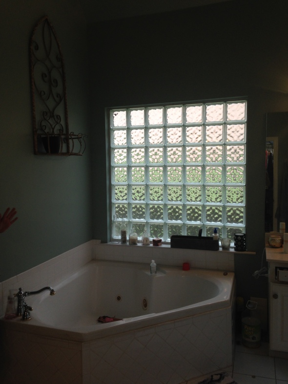
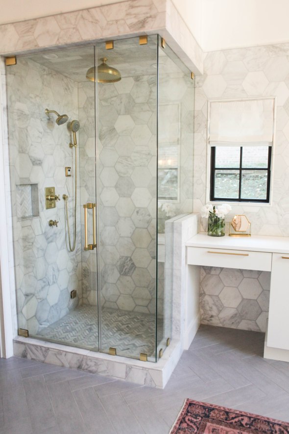
The cubed window was above the jacuzzi tub which all got ripped out and is now where the new steam shower is.
Before:
After:
We closed off the cubed window for the shower and added a small window beside it for more natural light!
His vanity used to be here, with the steam shower to the left of that closet door:
This is how it looks now:
We did a built in for plenty of storage where his vanity used to be and moved his vanity where the steam shower used to be!
Center view:
Her side:
His side:
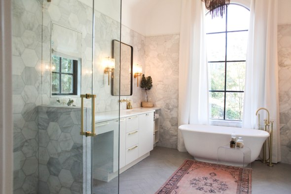
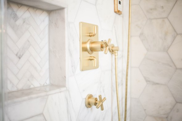
Now for some detail shots of the shower:
This shower has everything…steam control , aromatherapy, rain head, hand held spray.
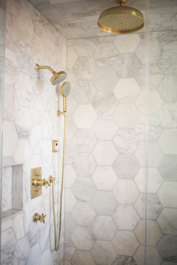
Marble and brass…all the heart eyes!!
Side view:
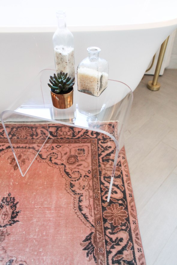
Now for some detail shots of the tub:
I will leave you with one more before and after!
Before:
After:

This was such a fun project for me and I can’t wait for my next remodel!
Thanks for stopping by!
xoxo,
O
Office Design
Posted: July 1, 2016 Filed under: Design Inspiration, My Design | Tags: before and after, design reno, Interior design, office design ideas, office transformation, Subway Tile, wood beams Leave a commentTwo years ago, I was able to design my first office.
If you didn’t see my post on that office, you can see it here.
Well, two years later in the same building, another company hired me to design their office and whew, did I have my work cut out for me.
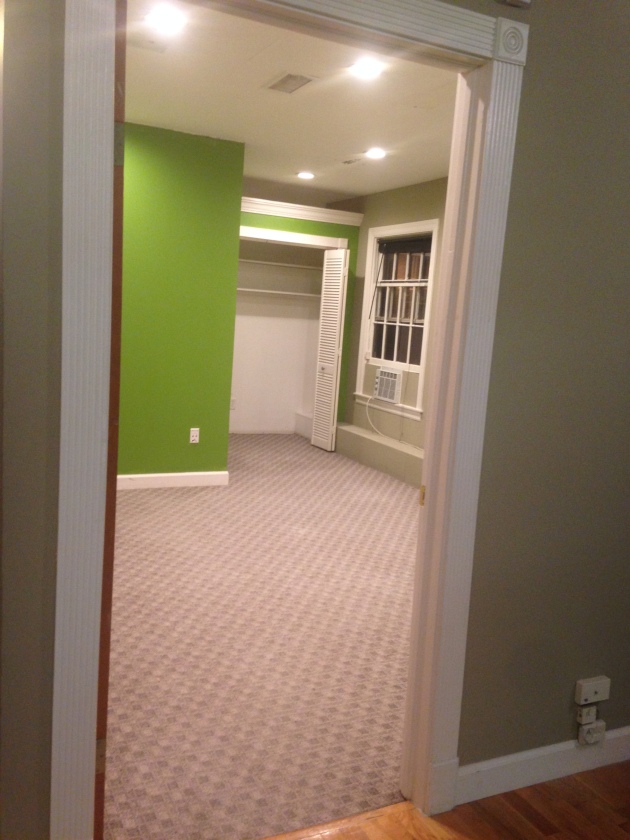
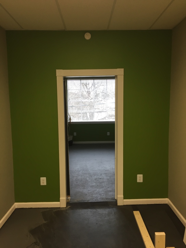
I had the first walkthrough at the beginning of February. Here is what I walked into. Fluorescent lighting, lime green, tan…eek!
They needed individual offices in this big open room so the painters tape on the carpet is where we were planning to build individual offices.
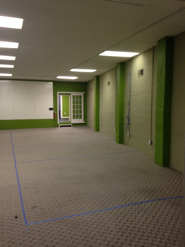
Other side of the room
My first thought was that the space felt stark and uninviting so my goal was to add character and warmth. I pulled inspiration from my other office..high contrast, clean, industrial and wood elements. The tough thing about this space as opposed to the other office was that this office has zero natural light where as the other office had tons of natural light. Trying to make this space feel inviting was quite the task.
First things first, remove carpet.

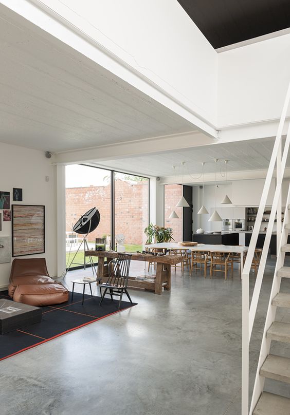
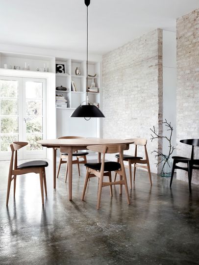
My initial vision was to sand, stain and seal the concrete for a clean, industrial look. Similar to this:
Unfortunately, once the carpet was removed we found that the concrete was not in great condition. Uneven, crumbling in certain places and not able to be sanded down. On top of those issues, the building is old with no elevator so the concrete guys had no way of getting their 1000 pound equipment in the room. Had to change plans so I decided to go with painted concrete.
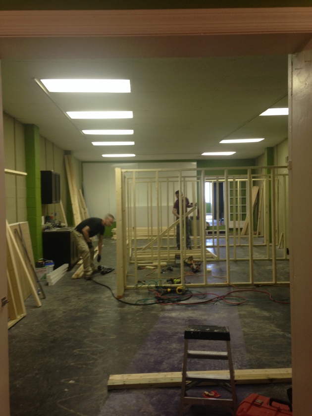
Moving forward from there was office build out.
Framing.
Sheetrock done.
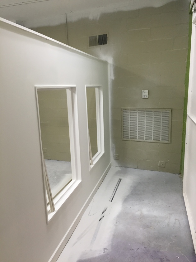
I decided to add windows on the ends of the build out to make it feel more open for the people working in the offices. If they can’t have natural light they can at least have a window. 🙂
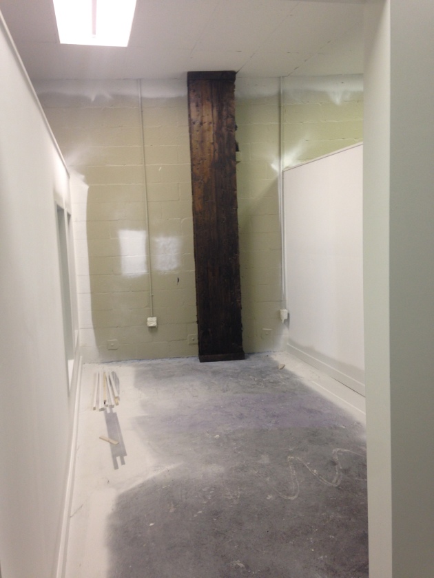
After the office build out, the lime green cinderblock columns got wrapped in wood and stained a rich walnut brown. I knew the first time I saw the space that the columns needed to be wrapped in wood to add character.
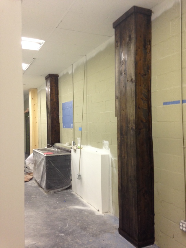
3 out of the 4 offices have a column.
This wall was saying goodbye to the dry erase boards.
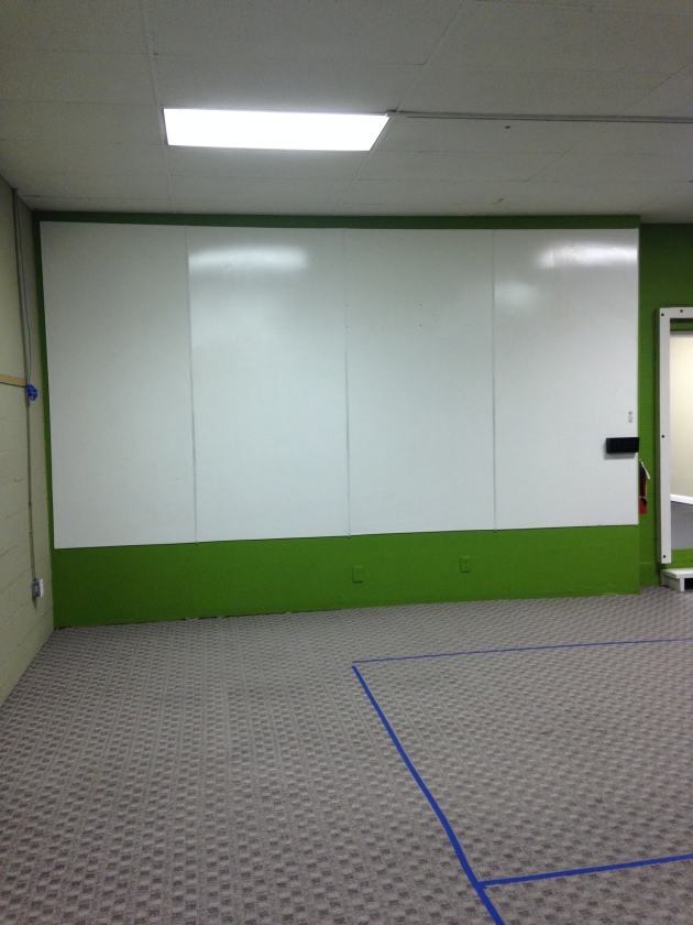
After ripping them off, we found that the drywall was in terrible shape and not salvageable.
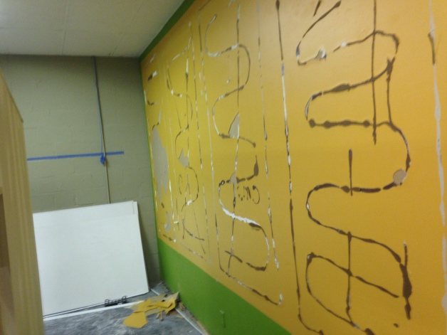
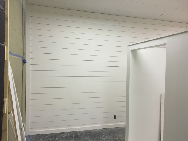
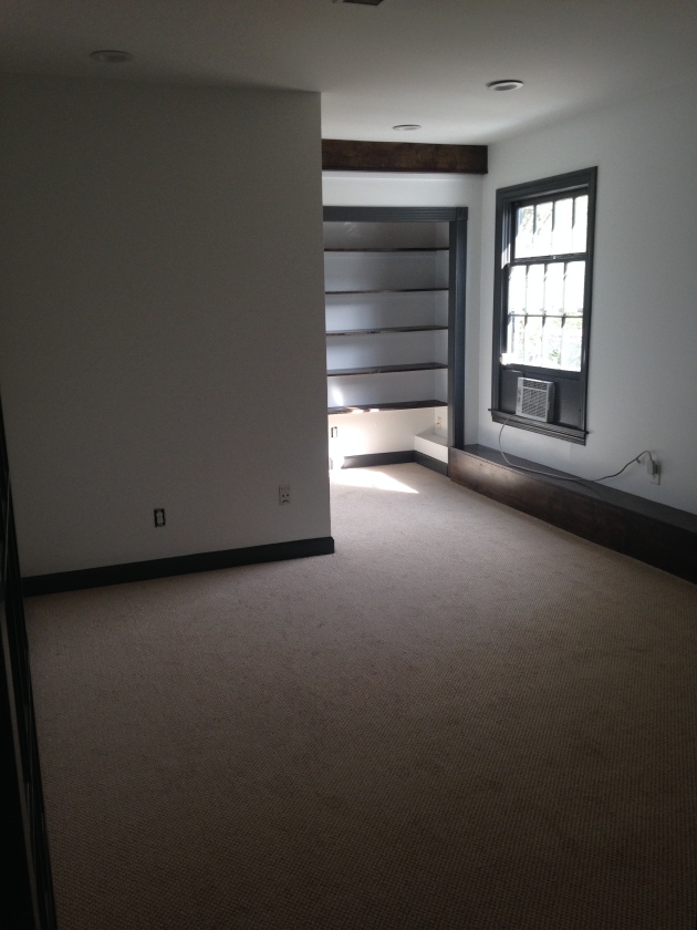
Solution=Shiplap
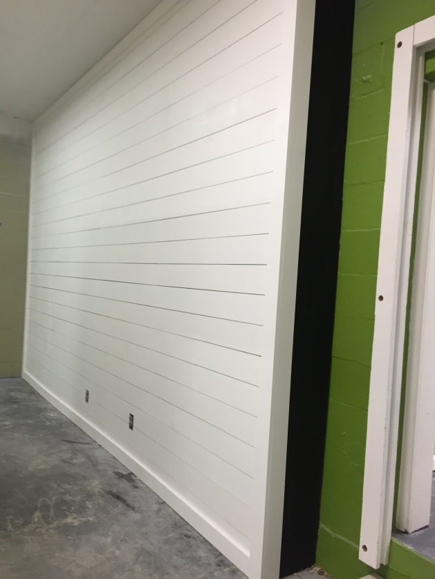
So fresh and so clean clean.
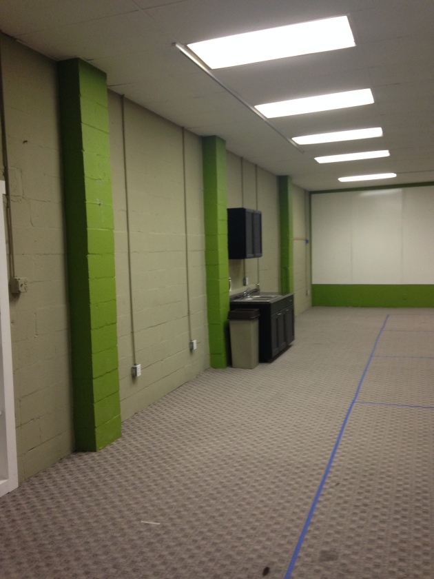
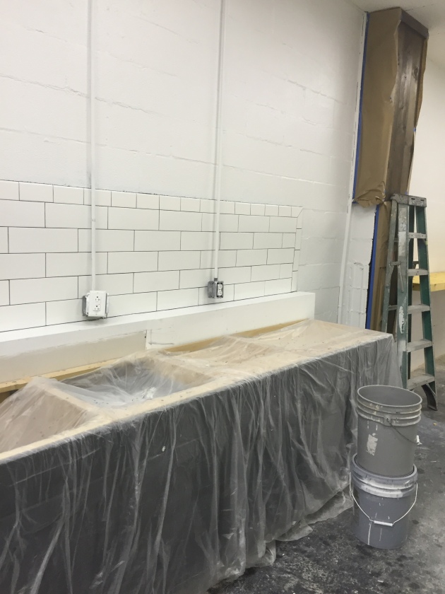
Another area to figure out was this odd “kitchen” area. They wanted to keep the kitchen so my thought was to remove the upper cabinet, add more lower cabinets and add a backsplash to make it feel more like a real kitchen.
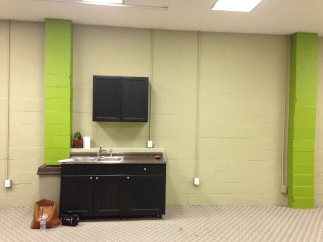
Added lowers.

Backsplash. Now it feels like a real kitchen area as opposed to the weird situation that was happening before.
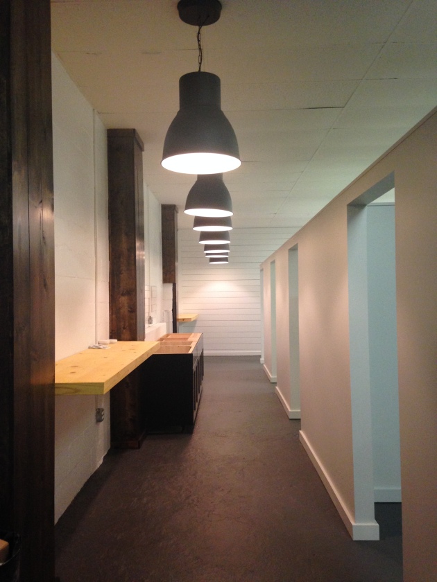
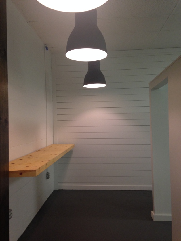
After all of that was finished, floating laptop bars and lighting were installed. Goodbye fluorescent lighting! In the photo below, the laptop bars aren’t finished yet, but this was the day that my vision was finally coming together. I used the same pendants that I used in the other office and I love the statement they make.
Oh, and here’s the finished painted concrete floors! Love how they turned out.
The lighting over the offices. Matte black tracks with bare bulb pendants.Love how it turned out!
A couple of other areas in the office:
Individual Office- BEFORE
AFTER
Fresh paint, carpet and added wood elements.
Conference Room- BEFORE
AFTER
Fresh paint, new light and wood accent wall.
Hallway- BEFORE (well, after prep work)
AFTER (pre art hanging, but you get the gist) Freshened up with paint and lighting!
Artist Interview area- BEFORE
AFTER
That’s a wrap!
I am having professional photos taken of this space so I will share soon 🙂
xoxo,
O
House Tour-Stephanie-Guest Bedroom
Posted: February 26, 2016 Filed under: Stores/Places to go Leave a commentWhen my sister in law, Stephanie, moved to Nashville a year and a half ago she had a new house and a blank canvas. She pulled inspiration photos, I pulled inspiration photos and the shopping/designing began! It was a lot of fun bringing a space to life and capturing her personality in the design. This is an all girls house! No boys allowed 😉
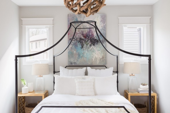
The wish list for this bedroom was: white bedding, abstract art, black iron bed.
This is the finished product. Clean and crisp.
All of the photos were taken by the talented Alyssa Rosenheck.
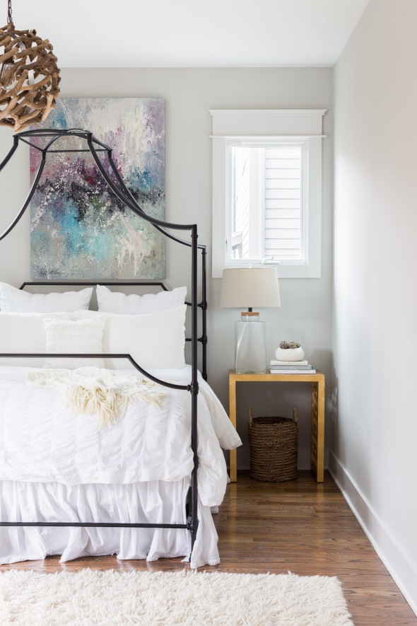
Detailed shots of the nightstands
One more full room shot
I love the contrast of the white bedding, black iron bed, colorful art and driftwood light!
Stay tuned for more photos of Stephanie’s house.
xoxo,
O
The Kitchen is Open
Posted: February 1, 2016 Filed under: My Design, Our House | Tags: before and after, design reno, Home, House Tour Video, interior decorating, Interior design, open concept, slate flooring, Subway Tile, white subway tile 1 CommentFrom the first day we saw our house, I had big dreams for our kitchen. There was only one wall standing between me and an open concept floor plan. It almost took a year of living in the house, but in November while we were on West Coast tour we were FINALLY able to get that wall down and start updating our kitchen. Excited was an understatement!
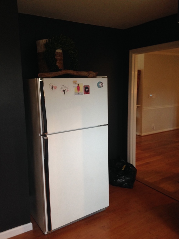
These were the last photos I took before transformation began:
This is the wall that kept me from an open concept for almost a year. Its days were numbered from the moment we bought the house 🙂
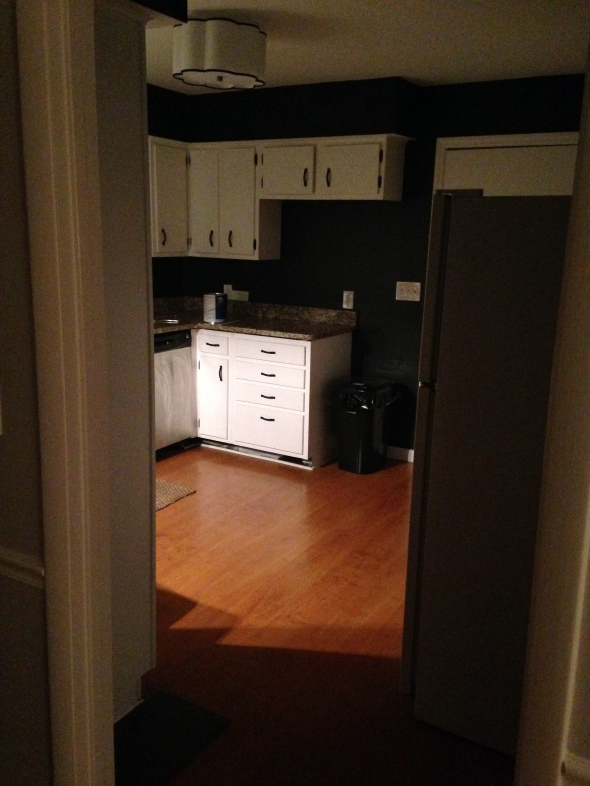
Entry into the kitchen. The only thing we had done at this point was get a new light fixture and paint the walls. It was very closed off from the rest of the house and not much fun to be in.

Same view, but daylight. The only redeeming factor are the big windows above the sink!
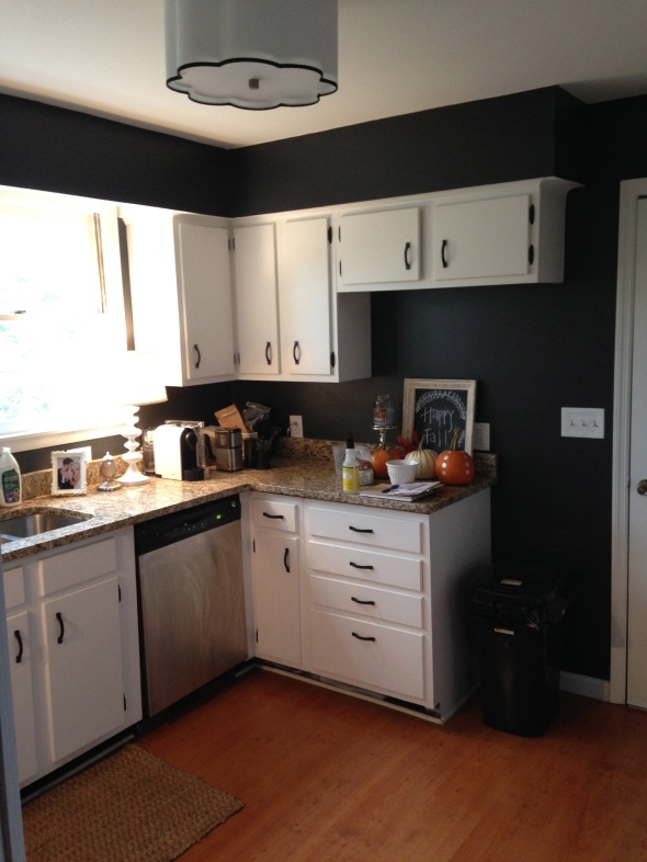
This is the wall from the other side.
Phase 1 of kitchen updating included:
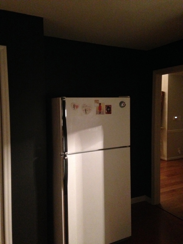
-remove wall (which is where the refrigerator was before which meant we had to find a new spot for it, so we decided to cut the cabinet and countertop off and put the fridge where it looked like it always belonged)
-new flooring
-subway tile backsplash
-new appliances
We would love to get new cabinets and countertops, but that will be in the future.
All of the work was being done while we were out of town so our contractor sent us photos of the progress.
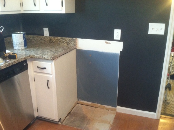
First step, cut countertop and cabinet where the fridge will move to:
Believe it or not, this small amount of progress got me super excited for the new kitchen layout!!
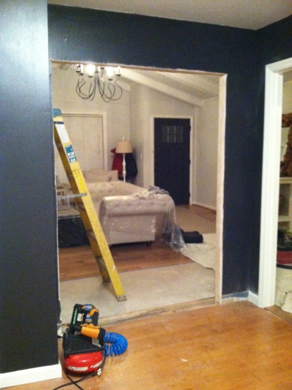
Next step, remove the wall and make an opening.
When I got this picture I literally screamed because I was beyond excited to finally have an open concept!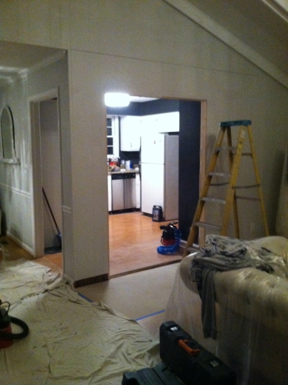
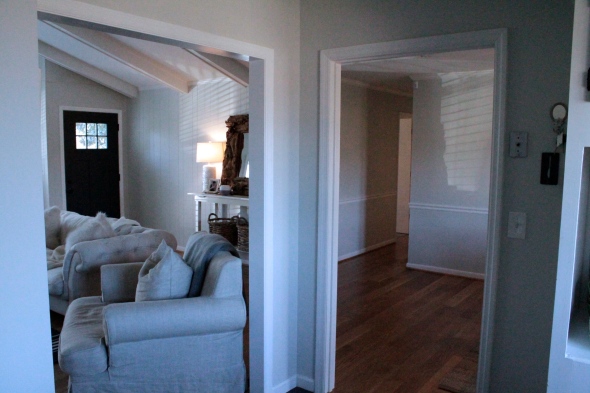
View now standing in the kitchen facing the living room. We can see to the front door now!! Woohoo!!
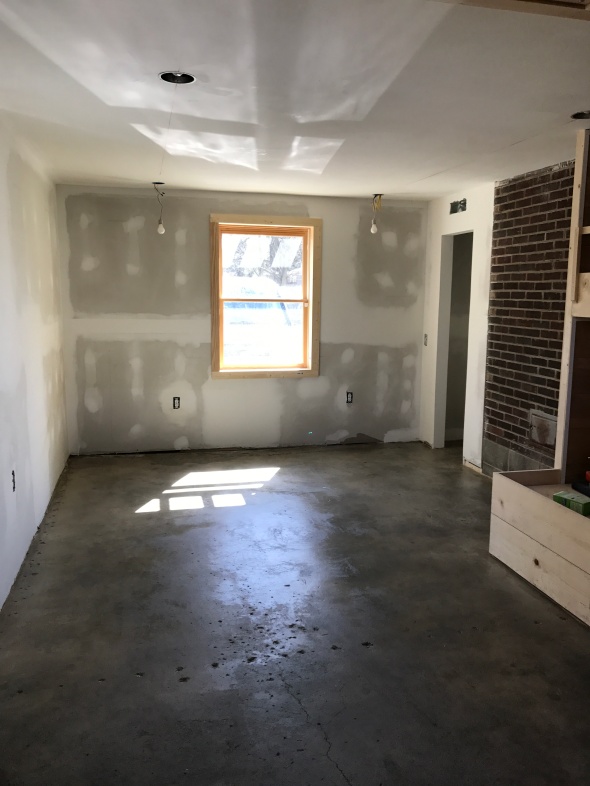
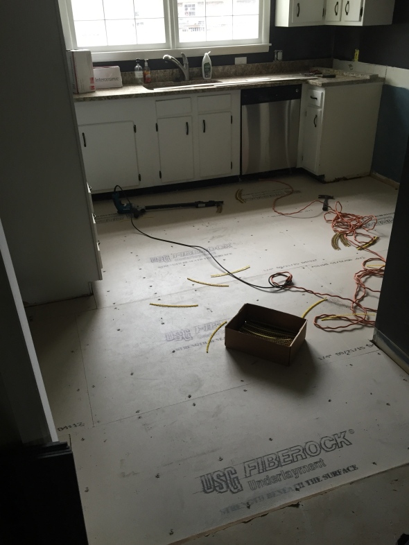
Next step, which proved to be the most stressful, was the flooring. When they pulled up the old floor there was a not-so-pleasant surprise underneath….
Completely rotted/moldy subfloor!!! (this was NOT a fun picture to get)
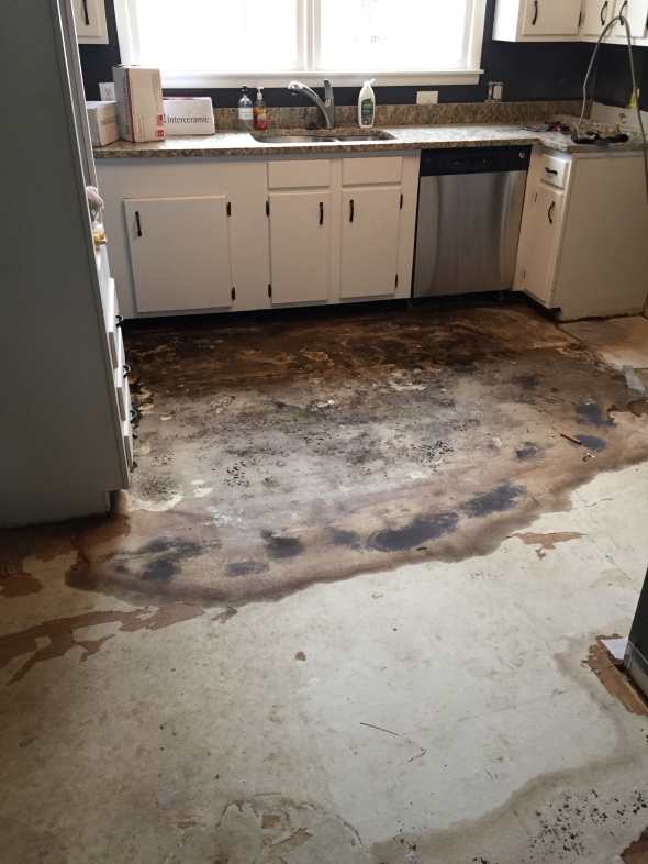
I’m really glad we weren’t there because the contractor said the smell was unbearable! EEK!
So the original plan was to rip out old flooring, apply cement board and lay new tile. Simple right? Well, plans changed when the rotten floor was revealed, so they had to demolish the subfloor all the way down to the joists!! $$$ (the joys of updating an old house)
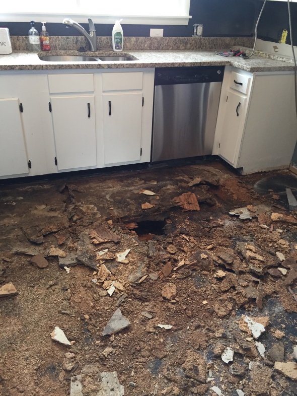
Getting these pictures while being out of town was definitely not fun, but we were just glad to know the mold was gone and a brand new subfloor was going in.
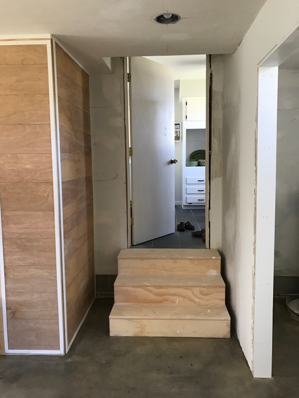
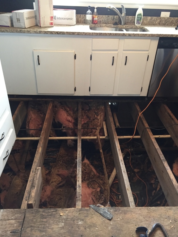
New plywood subfloor was laid and then cement board on top of that. Things were starting to look up 🙂
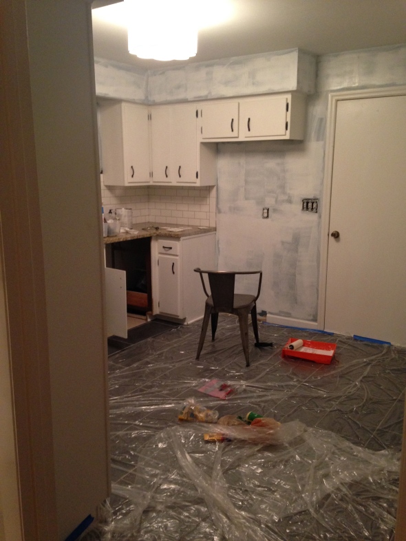
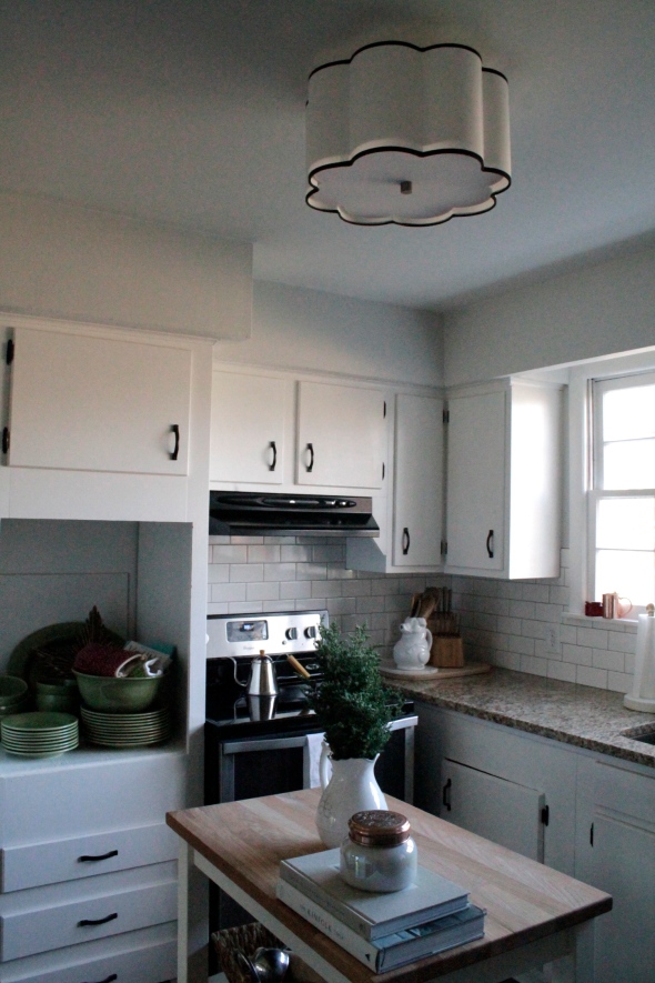
We got home from being gone 2 weeks and the very first thing we did was prime the walls because now that the kitchen was open to the rest of the house we wanted it to look cohesive.
Ready for some pretty photos now??
View in living room now!! A million times better!!!
Before:
After:
Before:
After:
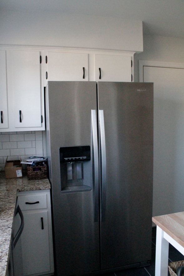
Before:
After:
I was so happy to get rid of the laminate orang hued fake hardwoods and replace with these beautiful tile floors!
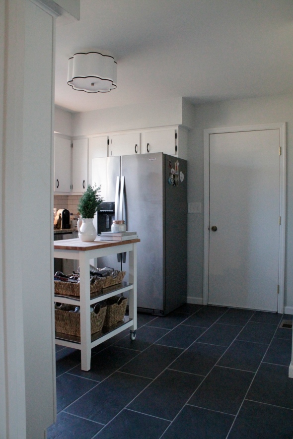
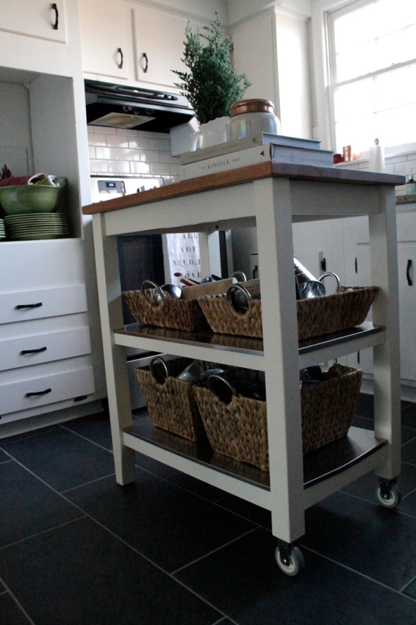
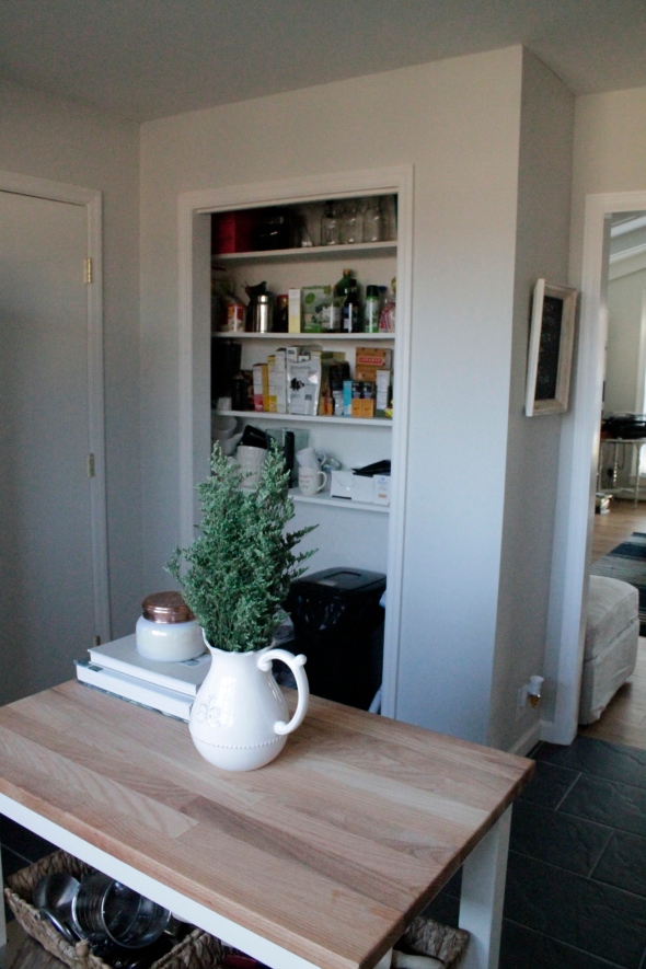
We needed some extra storage/counter space since we lost some when we moved the fridge. This little IKEA cart did just the trick. It’s the perfect size and look for the space!
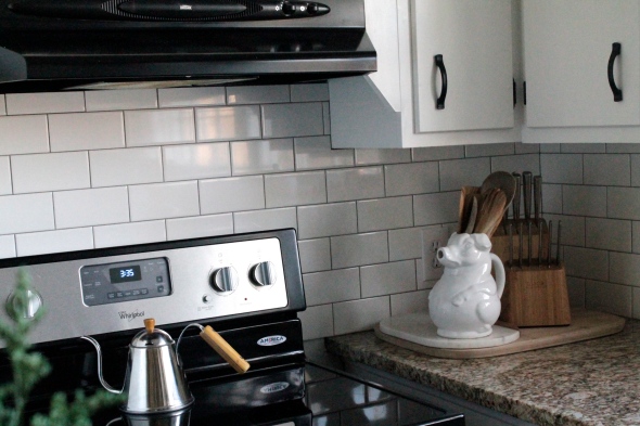
Subway tile will always be a favorite of mine. It’s just classic.
We took off the old bifold pantry door. Still need to get a cute curtain or something to hang, but for now it’s open and I don’t mind it 🙂
View from kitchen to dining area.
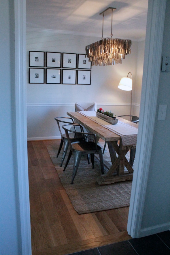
We are so happy with how everything turned out! It’s like that wall was always supposed to not be there! 😉
Our next project is our garage that’s not used as a garage anymore. I will be sharing that process as it happens!
Thanks for stopping by!
xoxo,
O
